
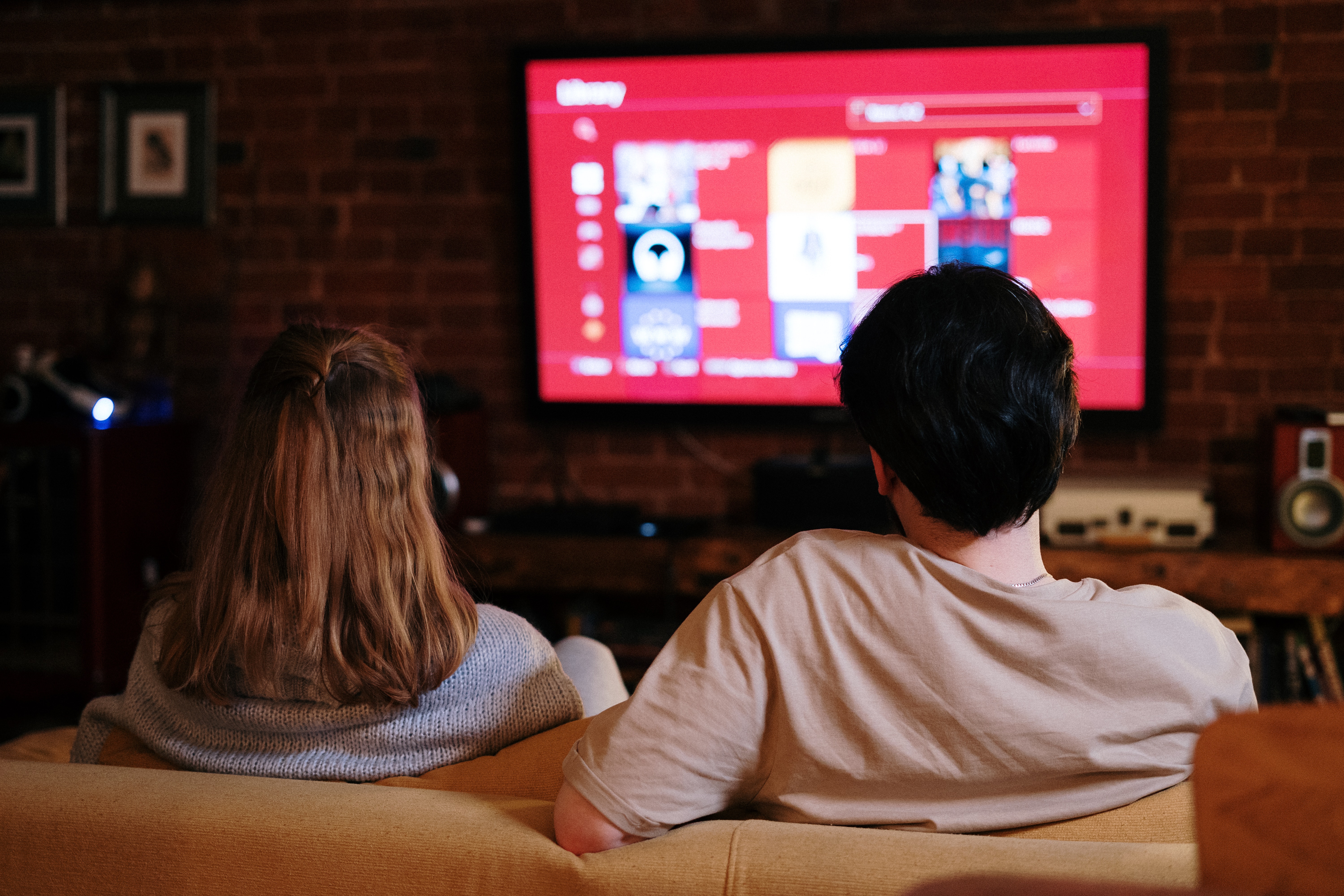
An Electronic Program Guide, also known as an EPG, is a menu of channels that you see in live television programming.
The user experience for traditional cable is challenged by the growing dominance of streaming media. The more fragmented the market becomes and the more choices the consumer has, the more important it is for providers to ensure their EPGs are intuitive, smart, and appealing. Updates are frequent and need to be tested and iterated quickly to keep up. Rather than wait for developers to code a functional prototype, a designer can work faster and apply user feedback by creating their EPG prototype in Figma.
Due to the number of repeated elements and artboards in an EPG, it is recommended to develop a plan with your asset management and file organization, so that you can be resourceful with your time to deliver the prototype and make edits quickly and efficiently.
Here are the 5 best practices I find helpful:
#1 Make sure your asset library is flexible for edits
An EPG will have common elements that will be repeated in many instances throughout your prototype.

Common elements you’ll need to have in your asset library include:
- Typically required:
- Channel icon or text cell
- Channel data cell
- Channel data row
- Top preview section for channel data
- On state for cell
- Optional:
- Primary/secondary navigation if your EPG sits within an app
- Background image if your EPG background changes based on the selection
- Verify your requirements in the very beginning to understand if there are other elements that may need to change as you navigate through the EPG
An EPG could have 20 - 50 channels, or more … now imagine having to make the same edit over 100 times across your elements!
In order to save time and a bit of sanity from too much repetitive work, have a strategy in place that allows your channels to be adjusted through the asset library.
Be resourceful with the auto layout feature and setting properties so that once you’ve established the parent component, you can create instances where parent edits will waterfall into place.
#2 Label and organize your prototype screens
Every time you click the remote, you need a new artboard to reflect where the TV remote is focused on in the EPG.
This includes:
- Where - which channel
- When - what time slot
- Where + When - the program itself and the updated preview window

Let’s use the EPG above for example. If you need to test for 5 channels and want the user to navigate until 9:00 PM, you would need to create these artboards...
|
Channel |
Number of screens |
|
DHC |
4 |
|
WUPL |
4 |
|
WWL |
3 |
|
TLC |
3 |
|
WDSU |
2 |
In total, that is 16 horizontal screens and 5 vertical scrolls, which will result in 24 artboards altogether.
An EPG prototype can quickly become a large, complicated file.
Here’s an example of setting your artboards based on the EPG above:

Tip: Use the Rename Layers shortcut to help with speeding up the naming process.
It’s so important to organize your artboards in the beginning so that you’re not overwhelmed from navigating and setting interactions in the file.
#3 Mark screens that will be important during user testing
The reality is that you may have over 100 artboards to navigate through in Figma.
In order to balance time for delivery and EPG fidelity, not every channel program has to have its programming data in the preview window.
Below is an example of two channels where one channel has program data and the other channel has placeholder content.


Since you will probably have more than 20 artboards in the Figma file, you’ll need a way to quickly see which screens have placeholder content.
In order to track which screens have specific programming content (areas the user research would test against), add light green circles outside those artboards as in the example below.

In addition to labeling, naming and placing your screens in a logical order, think about how you can add additional markups outside the screen to help you remember specific callouts for screens.
#4 Use a mask group for horizontal and vertical scrolling
As you are moving your elements along the page for each artboard, it helps to document your horizontal and vertical scrolling for consistency.
One strategy to help with the scroll is to use a masked group for a block of channel programs and channels.
In the example below, here is a group of channel icons in a mask.

In addition to a mask for channel icons, here is a group of channel programs in a mask.

A benefit of this strategy is that it allows you to move faster when creating additional scrolls for time slots (horizontal scroll) and channels (vertical scroll).
A limitation to this approach is that if you have programming set to different lengths and times, some of the content will be cut off rather than adapting to the block like an actual programmed EPG.
With the example provided, the priority for user testing was to see if the users would be able to use secondary filters. Since variety of program lengths was not important, it was a limitation in the prototype that did not affect user testing.
If you use a mask group to help speed up production, first verify with your researchers that this limitation will not impact their script and research agenda.
#5 Use switch overlay for app navigation
If your EPG is experimenting with navigation and secondary menus, you will need to take advantage of the switch overlay feature in the prototype.
You can learn more about switch overlays here.
Navigating screens using a remote - as opposed to a cursor in a Figma file - means that the “on” and “selected” states need to be visually clear. The user should know where they are (“on” state) and where they will be going (hover) when they press the enter/OK button.
This means you’ll need various states of the menu to mimic this functionality.
For example, if you have a navigation with Home and TV as options, you will need to create each version two times to show the on and hover state. These artboards will be connected with the switch overlay as you navigate up and down this menu.

Each artboard will also have to have a function to exit if the user does not select an item in the navigation. In the example below, pressing the right arrow closes the menu.

Although there are some technical limitations, creating an EPG in Figma allows you to have flexibility to make style changes quickly during design and even testing phases of the product.
In summary, to deliver an EPG prototype that is faster to produce and easier to maintain, make sure to…
- Create a flexible asset library that is easy to edit
- Label and organize your prototype screens by row and column location
- Mark screens that will be important for user testing
- Use a mask group for horizontal and vertical scrolling
- Use switch overlay for app navigation
With the popularity of streaming apps, the future of EPG design rests between new expectations with non-linear entertainment while also maintaining traditional TV device expectations.
As streaming technology continues to shape our expectations, it will be interesting to see how EPGs evolve with our entertainment habits.
Delivering an EPG that allows for iterative design during testing and discovery encourages designers to be more thoughtful in file management and organization.
The designers at Key Lime Interactive are experts at delivering iterative designs fast and efficiently. If you need help creating simple or complex prototypes for user testing, contact us.


Comments
Add Comment