

Many people will look at a UI design and think that the color choice comes from the preference of the designer- what they thought would look the best for the given project. While sometimes this may be the case, colors are often chosen carefully and with intention. Why? Color has been proven to have a great impact on the mood and behaviors of individuals and as a result, the overall success of a product, design or web page can rest on the colors that are chosen.
Not only does color have the power to impact our mood, which we will get into later in this article, but the color is one of the easiest ways to communicate with users. Color often time acts as a flag that helps grab user attention, while also being one of the easiest aspects for the user to remember about something (“The page with the purple background”). Color can also be used to help convey what a product, page or design is about. This is why it is so important to understand the ways in which color is understood and the effect that it can have on users.
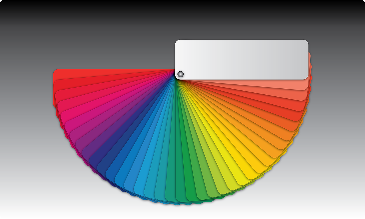
There is a great deal of science that exists behinds colors, the ways in which colors are created, and the ways in which these colors are understood by humans. It follows that there is a lot of categorizations that exist that colors can fall under, from primary to additive to analogous colors. For the purpose of this article, we aren’t going to get too in-depth into this part of color theory- there is just too much to cover. But just to make sure we are all on the same page, we’re going to review the basics: primary colors, and secondary colors.
Primary Colors: colors like red, yellow, and blue than when mixed together can make other colors (secondary colors)
Secondary Colors: a color that results from the mixing of two primary colors (yellow+red=orange, yellow+blue= green, red+blue=purple)
It is not a recent development that human beings can have emotional responses to different colors, color psychology is something that has been around for a while. Color psychology refers to the emotional responses that human beings have different colors, usually primary, secondary and tertiary colors. It examines the various ways colors can impact the way a person feels, thinks, and acts. Understanding the emotional responses or emotional conditioning that is associated with colors is an essential part of the color selection process: how do you want to make your users feel? Below is a breakdown of some of the commonly understood color psychology that is embedded into our primary colors:
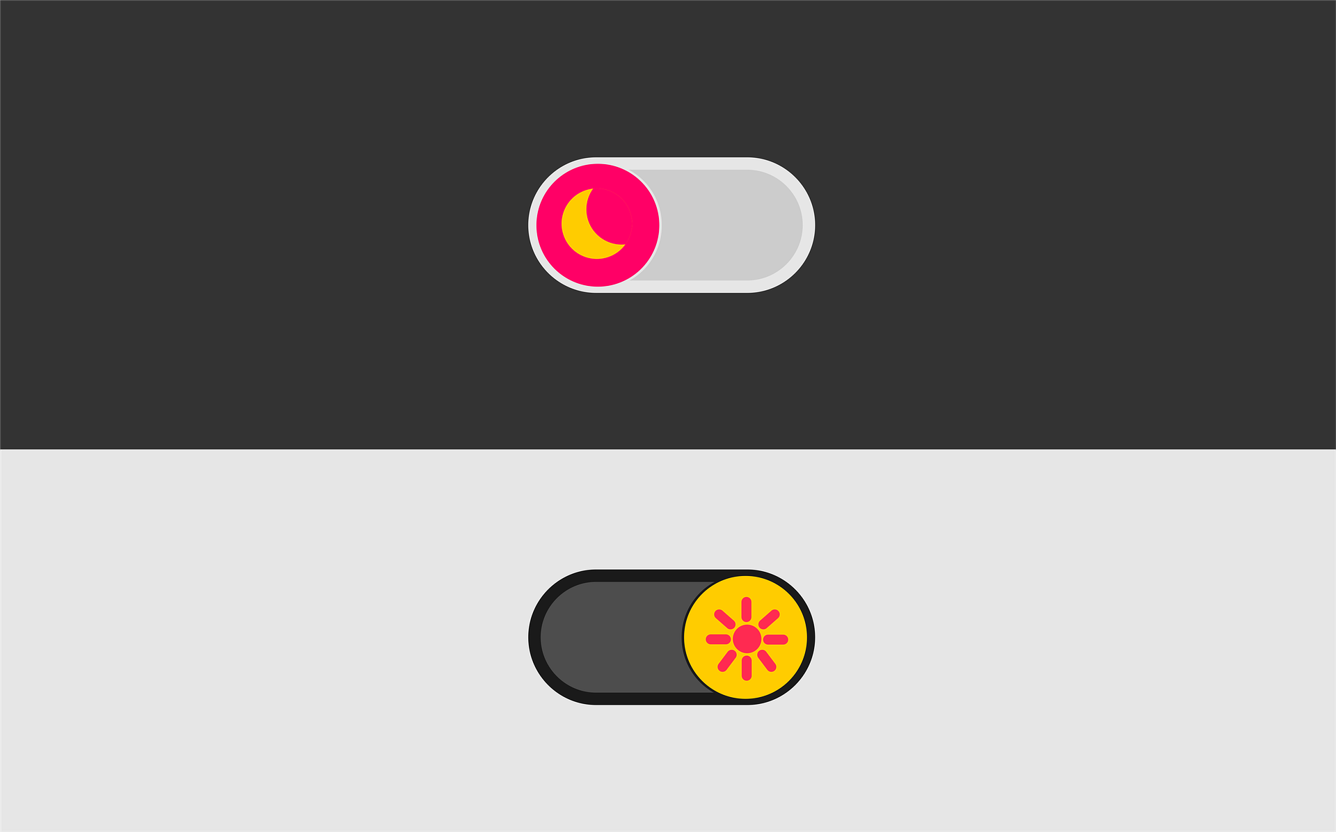
- Red- love, power, passion, energy. Red elements are more noticeable compared to other colors, can be used when wanting to attract the user’s attention.
- Orange- youthful, happy energetic and warm color. Orange is believed to increase impulsivity or even appetite.
- Green- soothing, natural, balance. Often times helps users feel calm, and it’s relation to nature helps to create feelings of growth or prosperity.
- Blue- Trust, intelligence, serenity. Using blue also often time makes users feel calm or refreshed.
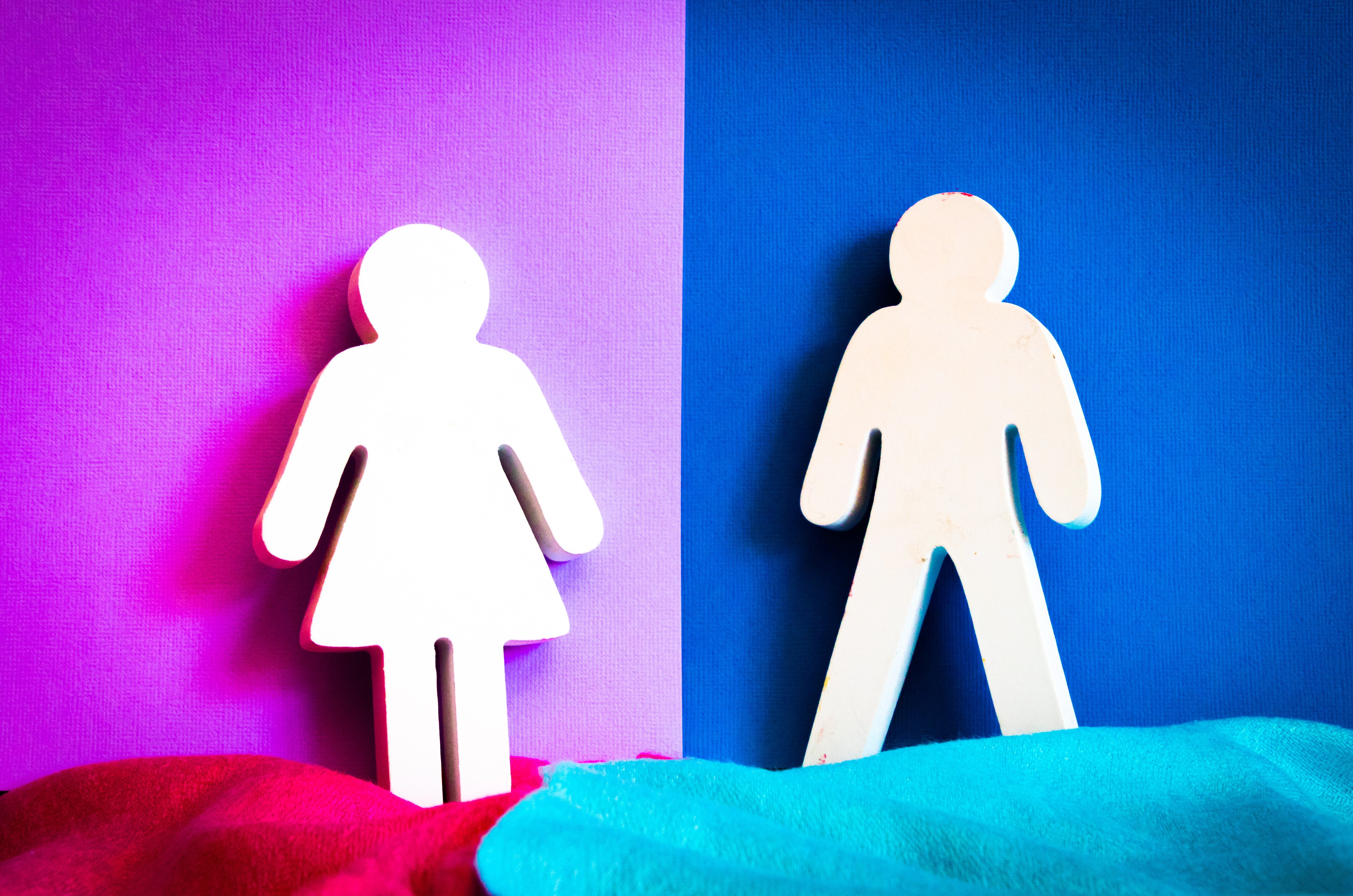
- Pink- Not just a “girl color”- pink can create feelings of joy or playfulness, also love and caring.
- Yellow- light, cheer, joy, optimism. Can help users feel upbeat or happy, as well as be used to draw attention to certain aspects.
- Purple- luxury, royalty, romance. Purple is recognized as being a color of royalty and helps give the feeling of exclusivity and luxury.
- White- clean, fresh, purity, simplicity. The color white helps create a feeling of simplicity, which can be seen as modern.
- Black- bold, rich, powerful, formality. Can be traditional and modern, as well as can be used to help draw attention to certain aspects.
A color is a tool that can help guide the eye; help users find the information they need or be used to draw the user’s attention to important parts of the page. This is why it is so important to make conscious choices when selecting the colors for a design template, a prototype, even a presentation. Colors and color schemes are a very important aspect of the user experience and oftentimes can elicit various different kinds of emotional responses from users. Color definitely has an impact on user behavior and enjoyment and as a result, it is important to know the various emotions that are often times associated with different colors and think about the way in which the color can help convey the message that you want.
READ MORE: Going "Off Grid", Accessibility in UX Design, Design Thinking vs. Design Feeling, How Biometrics Help Designers Design Better


Comments
Add Comment