

With so many moving components on large retail sites, it can be easy to lose sight of usability best practices for small, specific interactions. We took some time this week to comb through some large electronics, clothing, and warehouse retailer’s desktop sites to see which companies are giving the best experience, and which have room for improvement. In the following article, we’ll show usability mistakes retailers are still making on some of these sites in product detail and checkout pages, as well as other sites that show how it should be done.
Mistake #1: Not having enough payment options
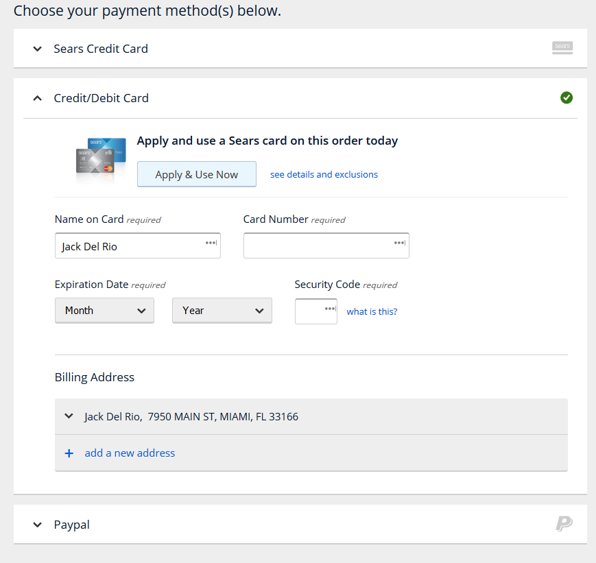
In a time where you can make a credit card payment in a store with your mobile phone or smartwatch, there’s no excuse for limiting customer payment options on a desktop site. There are myriad options available, including PayPal, MasterPass, and Visa Checkout, and making these available can increase conversion with only a little effort. However, on the Sears desktop site, these additional payment methods are mostly being neglected. Sears does allow PayPal checkout, along with standard credit card and gift card options, but that’s the extent of their offering.
Contrast this with Newegg’s checkout page, which is rife with options to ease the purchase process:
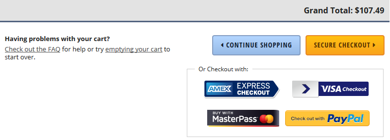
From the consumer point of view, there are few things more frustrating than trying to give a company your money, but having to jump through the same old hoops to do so. Since your customer’s credit card information is likely already stored in a safe place online, give them the option to use it.
Mistake #2: Neglecting the “Store Pickup” shopper
It is one thing to assume that most customers on your site are looking to make an online purchase to be shipped, but for companies with many brick and mortar locations, you can’t neglect the store pickup option. And this means more than doing just lip service, which you’ll see in these examples.
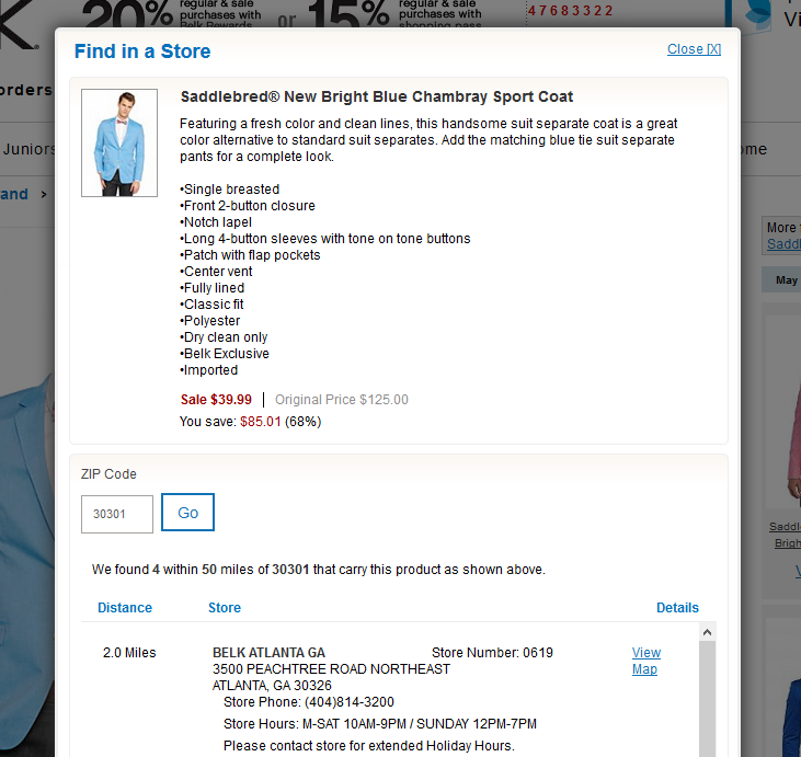
On the Belk website, it takes an additional click from the product page to open the “Find in a Store” menu from the product details page. After that, the user must enter their zip code (no geolocation option), and are then told which stores are nearby that carry the product. What’s missing here? Let’s take a look at another site and see.
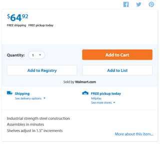
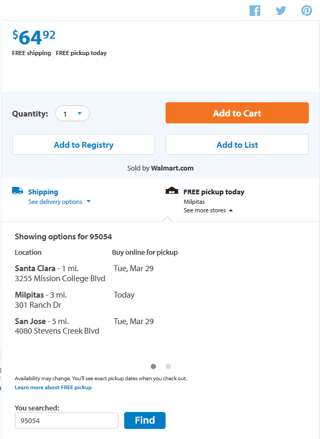
As one of the giants of retail, and a company known for its online integration, it’s no surprise that Walmart provides a best practice example here. When shopping for an item online, the right side of the product detail page already lists the closest store (located via GPS) where the item is available right now. Expanding the menu gives more local options for pickup, complete with the date for that pickup, as well as the option to enter a zip code manually for another location. An important thing to note here is that the site doesn’t by default display the closest location, but the closest location where the customer can pick up the item today, which could be important to the visitor who doesn’t want to wait for shipping.
Mistake #3: Burying Shipping/Delivery Information
While we’ve dealt with shoppers interested in store pickup above, what’s best for those looking to have an item shipped? We covered how important free shipping is to consumers in our retail shopping webinar back in January, but timing can be essential. Anyone who has shopped online for a gift has experienced the disappointment of finding the perfect item, only to find out when checking out that it won’t be there in time for the event. Retail sites can avoid this issue by keeping important information up front and easily accessible.
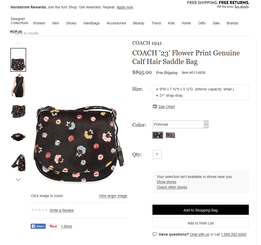
Nordstrom addresses some customer concerns in this area by highlighting free shipping in their promotional material in the top right, and also just next to pricing in the product details. However, there is no information about how long the item will take to ship, nor a link to find this out; customers must add the item to their shopping bag and proceed to the checkout process to continue.
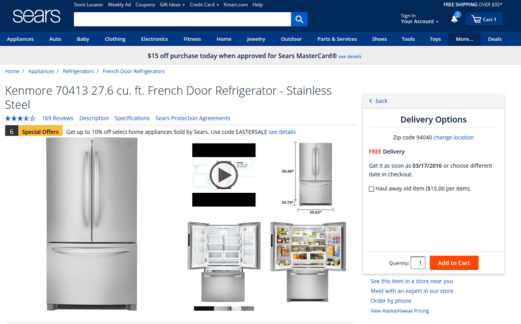
Although Sears was dinged earlier for lacking payment options, their handling of shipping and delivery options is exceptional. Free shipping is listed in the top right of the page as an ongoing promotion, and the delivery timing defaults to your current location while still allowing you to change it if needed. It is a simple change, but keeping these options outside of the cart and checkout process lessens customer frustration when an item can’t be delivered on time.
Mistake #4: Review Filtering Limitations
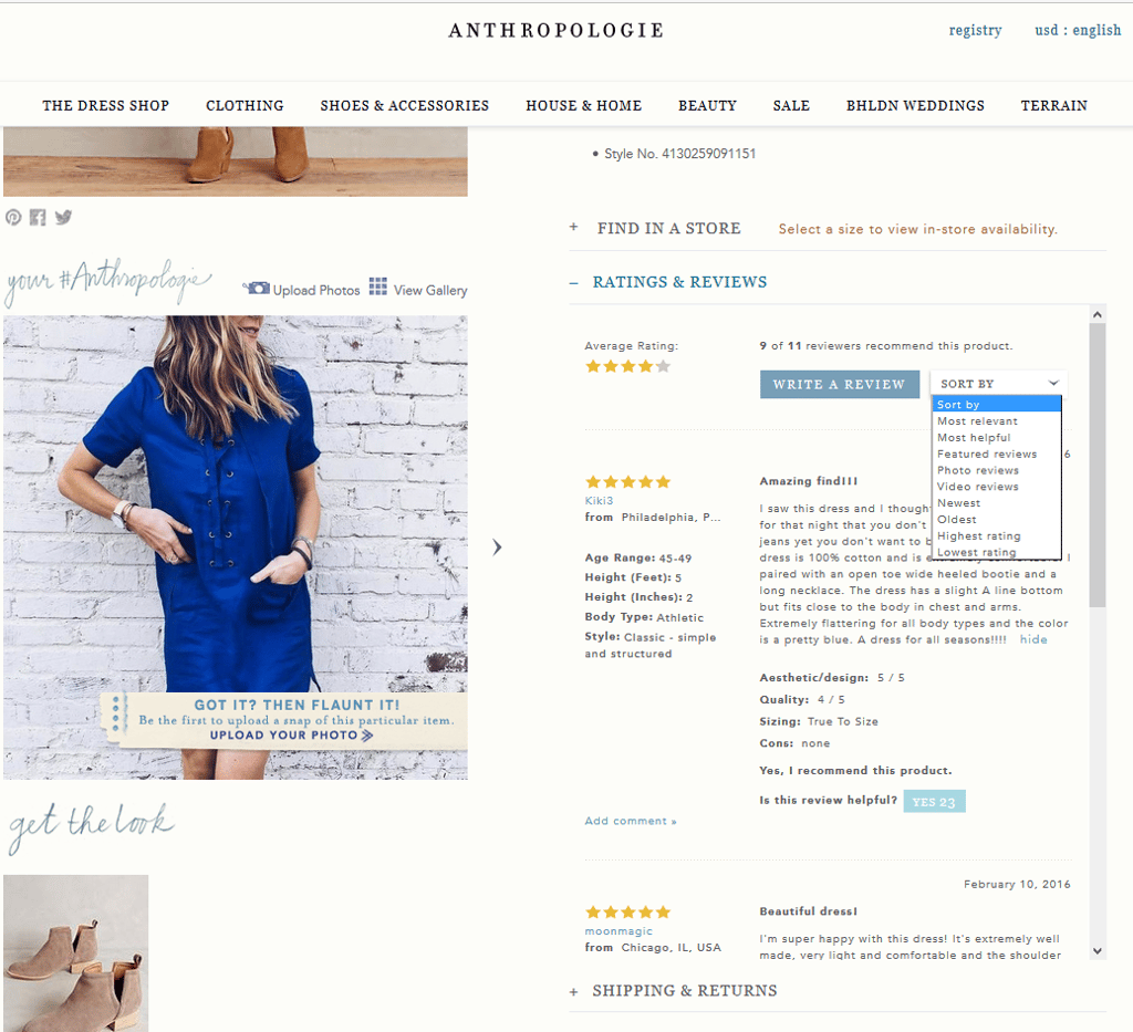
Customer reviews are essential, and it’s rare if not impossible to find a retail site now that doesn’t provide reviews in at least a limited capacity. But like all things in usability, the execution of this feature is more important than just having the basics. On the Anthropologie site, the reviews are almost, but not all the way there. Below you’ll see a bevy of sorting options, as well as the ability for reviewers to add personal info important for fitting, such as height and body type, and to add descriptions of the garment such as design, quality, and sizing. But with all of these extra descriptors, Anthropologie is lacking the ability to search reviews, or filter by the descriptors, making these factors only useful when viewing a single review. The ability to filter by “Body type: athletic” or by “Height” would help propel Anthropologie to the next level.
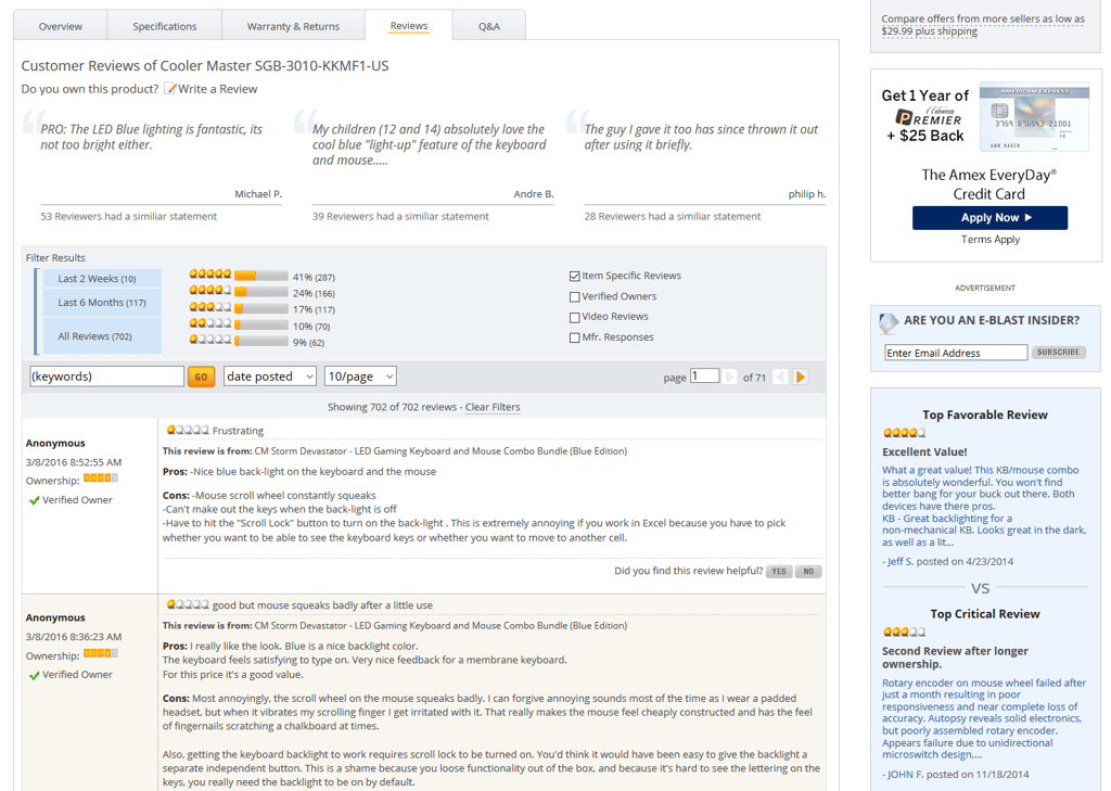
While Newegg is handling a different type of product, usability best practices still apply. Newegg’s reviews contain tons of useful ways to find insight, including automatically bubbling up reviews with common statements, filtering by a particular star rating, filtering by recency of the review, whether the user has a video or is a verified owner, and even reviews with manufacturer responses. On the right side of the page, the top favorable review and top critical reviews are listed as well. Since that’s not enough, users can also search by keywords, select the number of reviews per page, or sort by a few more common options (not pictured). There is not much more a user could ask for to help make sense of the customer reviews.
Mistake #5: Making Guest Purchases Difficult
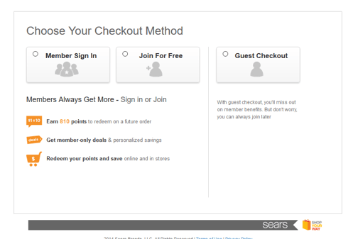
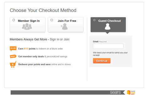
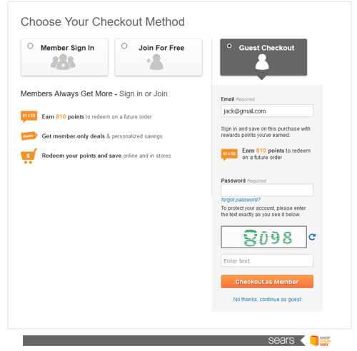
Listen, we understand. We really do. Getting new customers to register is important for many, many reasons. But people are becoming more and more wary of giving away their information online, and it’s easy to alienate new customers by being too pushy about their information. The Sears website unfortunately falls into this trap, making purchasing as a guest so difficult that a new customer may just give up and look elsewhere for their purchase.
The process starts out alright, with Guest Checkout as one of three options for the customer to proceed. The next step is also fine, as an email is the basic requirement for online orders. However, the third screen is where we run into an issue. Flowing directly down the page from the email text is now a required password box. This doesn’t make sense to the user, as they’ve already said that they don’t have an account and would like to proceed as a guest. Further below that is a captcha, and then the main call-to-action to check out as a member; only after skipping the bright orange button is the option for a user to continue as a guest. Users may feel at this point that they’ve been roped into becoming a member and exit out of the checkout process, and we wouldn’t blame them.
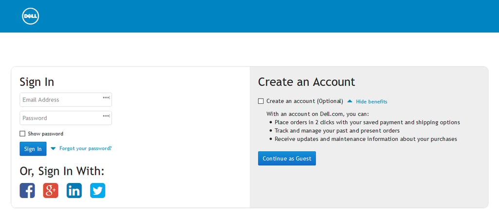
Dell, on the other hand, gives customers the best of both worlds. Returning users can sign in with their account, or any number of social media accounts, while guests can continue unhindered, with an “Optional” checkbox for those interested in creating the account during the process. Dell even provides helpful information in an expandable area that could entice users to make an account.
These five mistakes could be hurting your site’s conversion and customer retention right now. Take a moment to see how your site is handling these interactions, and make sure you’re following the tried-and-true best practices. For more information on our research into retail sites, apps, and mobile sites, and to learn how we can help you in your research plans, contact sales@keylimeinteractive.com.






Comments
Add Comment