
A few weeks ago we explored the concept of Design Thinking and how that can be carried out in order to better understand a user's pain points and learn how to effectively address them. During the design thinking process, there is a brainstorming phase in which all the ideas surrounding user opinions, user needs, and UX design issues are brought to light. This can be a pretty overwhelming portion of the design phase, and brainstorming is something that can occur even outside of the design context. However, brainstorming can often become cluttered and overwhelming if there are too many ideas being thrown around. So, how do we organize all the great ideas we have so that we can figure out the best ones?
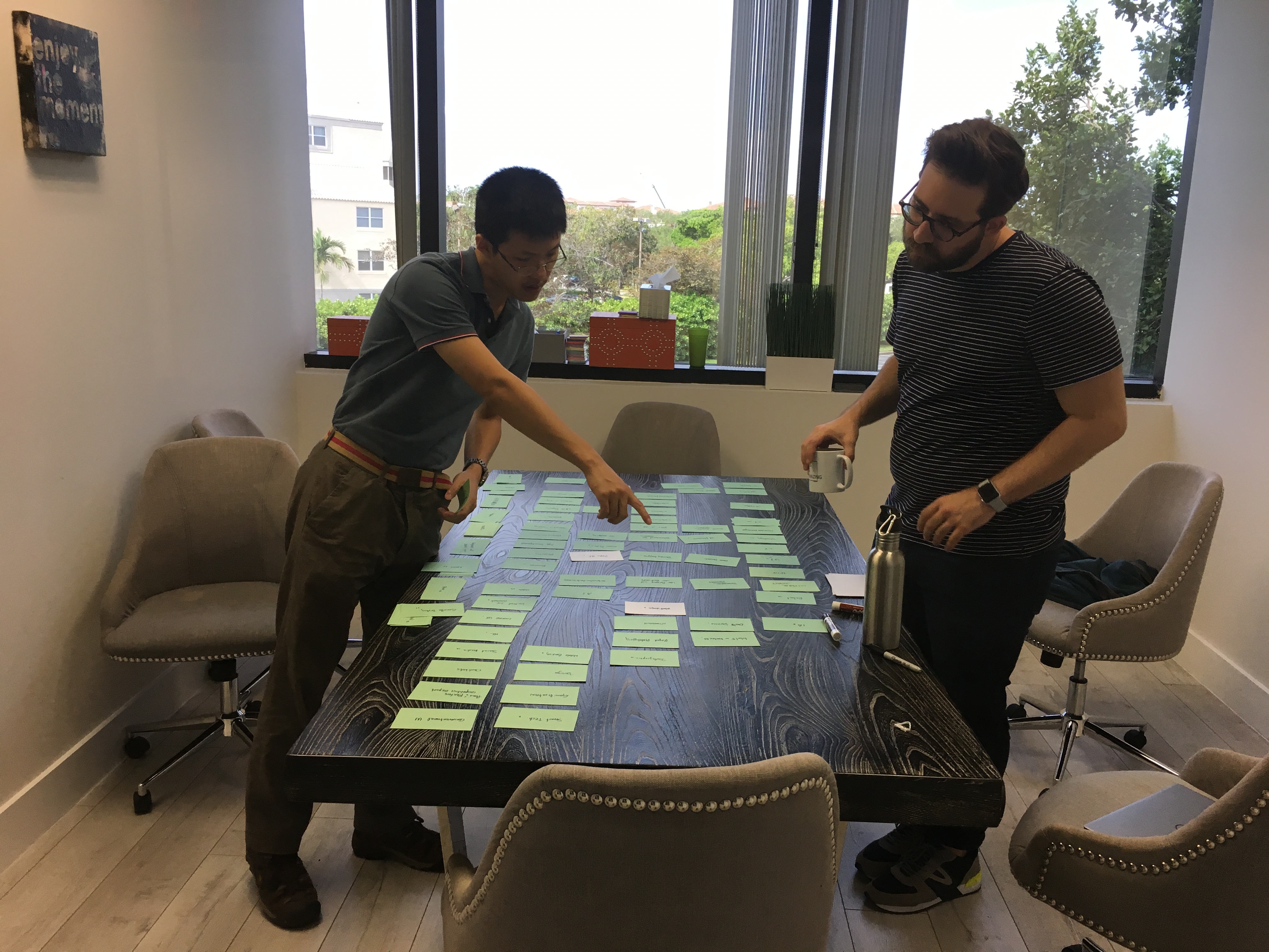
This is where affinity diagrams (of affinity clustering) can help with the user experience design. Affinity diagrams are an organizational tool that seriously helps to make sense of the various ideas that can be generated during a project or a research phase. The basic concept behind affinity diagrams is to gather large groups of data and organize them based on their natural relationships, or their affinity to each other. Affinity diagrams focus on synthesizing large groups of information into groups based on major themes, which helps to bundle and group information that may seem disorganized or all over the place.
Here is how to carry out your own affinity diagram:
- Record each idea or piece of information on cards, pieces of paper or sticky notes
- Look for ideas or pieces of information that seem related- It is important to remember that this does not need to be based on any fact, just what looks or feels like it should go together.
- Sort into groups based on the above method until all the cards, pieces of paper or sticky notes are used up
- Once these groups have been created, it is possible to synthesize further and organize groups into subgroups based on the same process from step 2
If you are reading this and thinking to yourself, “wait, this sounds a lot like card sorting!”, you aren’t wrong. Card sorting and affinity diagrams are very similar in the way they are carried out; even in the way in which they end with organized and labeled information. The difference lies within their end purposes and how they are achieved. Card sorting is typically a UX method that helps researchers better understand what information the user sees as being related and the way they create groups; whereas affinity diagrams are more focused on organizing research, getting teams to brainstorm, and synthesizing information into groups.
To utilize affinity diagrams to their fullest, it should be used when there is a large amount of data to sift through or when you want to help fuel some out-of-the-box thinking. If there is only a small amount of data or ideas being looked at, affinity diagrams might not be the best method. Affinity diagrams are best used for condensing a large amount of data into smaller groups organized by theme and relevance to each other. Additionally, affinity diagrams help to encourage innovative feeling by encouraging people to place things into groups based on what they feel goes best together, rather than using intellect or rationalization. This process can help breakthrough traditional forms of thinking by encouraging different ways of organization and thought, which can often time lead to new and creative ideas.
READ MORE: Design Thinking vs. Design Feeling, A/B Testing, IA Issues? What Do You Do When Online Card-Sorting is Not Enough?, Taxonomy and Using Tree Tests to Optimize Site Navigation and Content Structure


Comments
Add Comment