

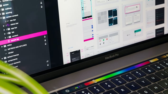
Last year, I created a series of blogs regarding creating a custom Material-UI theme (Part 1, Part 2, Part 3). While many parts of that blog are still relevant, such as how to customize different components, Material-UI (user interface) has streamlined the process to create a custom theme.
Use of Color in a Material-UI Theme
Thankfully, there’s no longer the need to create a massive color palette with 14 shades of 13 hues. Making that huge color palette about made my eyes cross, and I noticed that when wireframing, we really only used a handful of colors. At one point, I created customized chips for all of the 13 hues for use when we’re categorizing filters. We found that by using more than two colors one the screen in one place was distracting to the user, and pulling all of their focus on those customized chips. It also seemed unorganized and a bit confusing. We ended up not using them to categorize filters, and just used one color for the chips and used icons to categorize.
The guidance from Material-UI is to create a color palette for multiple different background colors, including a light and dark theme mode, primary, secondary (with variants for both), error, info, warning, and success. Each color has a light, main, and dark variation. The awesome part is that if you only provide a main hex or RGB value, Material-UI will calculate the light and dark variations for you! However, we found that the contrast wasn’t enough and we needed to raise the tonalOffset value. The tonalOffset value is a decimal value that determines how much difference there is between the light and main and main and dark variations, if the light and dark are not provided manually. The default tonal Offset value is 0.2. If you’re referencing the previous way to create a color palette, the main color would be a [500] shade, light [300], and dark [700]. If the tonalOffset is raised to 0.4, then the main color is still [500], but light would be [100], and dark [900].
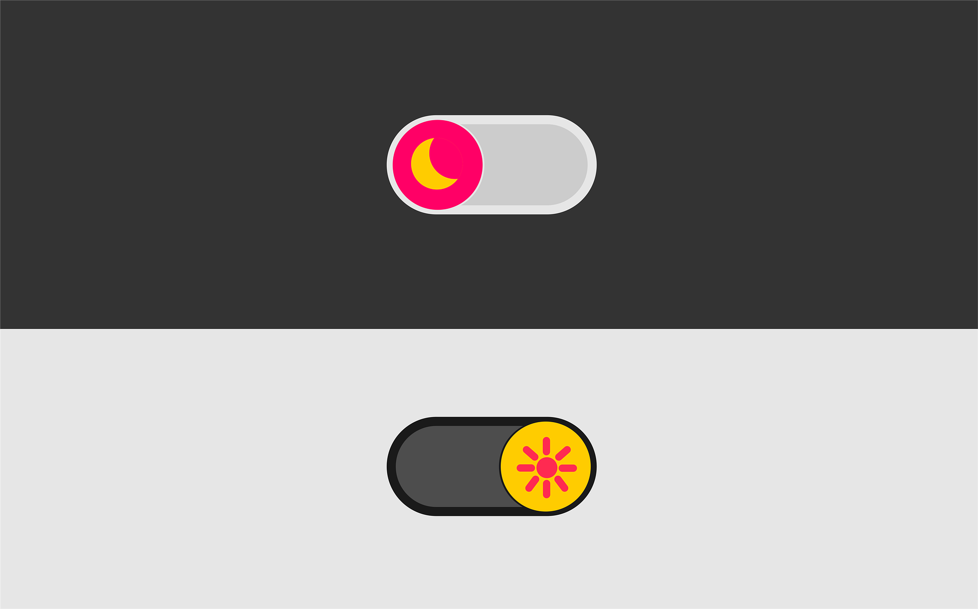
Since our users often use the dark theme mode, we have to make it seamless to switch back and forth from light to dark mode. We found it too difficult to create a color palette that was pleasing to our client, and that provided enough contrast in both light and dark modes. So, we created one palette for light mode, and a separate palette for dark mode.
If you want more guidance on creating a Material-UI palette, check it out straight from the source!
Implementation
When creating the custom theme object, I created variables for primary, secondary, error, info, warning, and success.
var primary = state.darkTheme ? ‘#9ac53d’ : ‘rgb(14, 139, 68)’;
We have a state variable, darkTheme, that lets us know which mode (light or dark) the user has chosen. While I don’t suggest mixing hex and RGB values, the theme object will take either color value. To create the theme object:
var theme = React.useMemo(function() {

  return core.createMuiTheme({

    palette: {: {

      type: state.darkTheme ? ‘dark’ : ‘light’,

      primary: {

        main: primary,

      },

    },

  });

}, [state.darkTheme]);
More documentation on the default Material-UI theme
Material-UI 4.0 and above has a lot of documentation in both JavaScript and TypeScript. In fact, all of their components have a TypeScript version. Implementing the theme in TypeScript vs JavaScript is just slightly different, and if you’re not paying close attention to the details, it will cause some very confusing errors. Note that both the import and const statements are different. If you’ve previously used the JavaScript version and are switching to the TypeScript version, make sure you import from core/styles, or your const won’t be able to find the theme object.
TypeScript:
import (makeStyles, createStyles} from ‘@material-ui/core/styles’;
const useStyles = makeStyles((theme) => createStyles({…}));
JavaScript:
import { makeStyles } from ‘@material-ui/styles’;
const useStyles = makeStyles((theme) => ({…}));
There have been several times where I’m using a JavaScript library for components on the screen (such as data visualization libraries), and I need to use theme specifications for those components. Or I can’t use the const for the styles listed above. The theme component can be called from inside a function with the useTheme hook.
import { useTheme } from ‘@material-ui/core/styles’;
function coolStuff() {

  const theme=useTheme();

}
More documentation on Material-UI useTheme hook


Comments
Add Comment