For all you sports fans I'm sure you've seen and formed an opinion about the new ESPN responsive website. Most of the comments I've seen have been negative. In fact, most site visitors who have expressed their dislike for the redesigned site have done so in a very colorful way:

I spent a fair amount of time on Apr 2, 2014 reading through thousands of user comments and was only able to find three that were not negative:


I can't really say they were positive, just not the common variety of "this is the worst thing EVER!" or "is this an April Fools joke?!".
Now we all have heard the adages: "If it ain't broke don't fix it" or "people don't like change", but many of the comments were very specific in detailing WHY they disliked the new design. In short, it is different, but more importantly it forces them to change the way they normally interact with the site. No longer are they able to scan headlines, but now must scroll endlessly through entire stories that ESPN deemed newsworthy*. *This has been changed since the writing of this article. The homepage now features bi-lines of top stories instead of displaying them in full.
Here's an example of how site visitors indicated they typically interacted with the site: I would normally come to ESPN for a quick glance of the top stories then, as time permitted, would dig deeper into the topics / articles that are of highest interest to me.
What I read over and over in the user comments was that site visitors would normally use the homepage of ESPN primarily as a means to scan. Therein lies the problem with the new design. It's much harder to do that now. The number of stories/headlines that are available, above the fold, has decreased.
Those in charge at ESPN have taken their 6+ months of user testing along with their business objectives and have decided that the homepage interaction should now be different. Did they underestimate or misinterpret their data and come away with a design that didn't meet the needs of their site visitors? Or did they intentionally redesign the homepage in a way that would force users to interact with it differently?
As of the afternoon of April 3, 2014 the answer is clear, they goofed. Midway through my article I noticed a change on the homepage. The endless scroll of the homepage where you had to view full stories before advancing to the next was replaced to only include snippets of the main stories. Scanning is now much easier than its initial release, however, some may still not enjoy the endless scroll. While many site visitors commented the design was yet another example that ESPN didn't "listen" to them, I'd have to say this is clear evidence of how responsive ESPN can be.
If this is any indication of things to come, I could see ESPN making continued updates to further refine the interaction, but how many customers did they alienate in the first two days of this new release? Since I started this story, not only have they changed how they display stories on the homepage, they have darkened the background from white to a gray to increase the contrast, which too, was another complaint site visitors had.
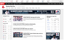
There still remains much to do. Some secondary pages still have the endless scroll from story to story (e.g., ESPN Cities blog pages), which is even more difficult to deal with when on your smartphone. Navigating horizontally through the site content once you go 1 or 2 levels deep is a major issue, and not every team page has the same layout (e.g., Boston Red Sox = New/Good, Boston Bruins = Old). These are some of the first enhancements that would go a long way to improving the user experience.
 New Team Page Layout
Conducting user research is important, but what you take away from that research is much more important in our opinion. At KLI, we like to call that 'being data informed rather than data driven.' ESPN has shown they can be responsive and make on-the-fly changes that correct/improve the user experience, but are you as flexible?
We at KLI pride ourselves in making sure the insights you learn from research are in alignment with user needs and respect, not only what they do, but why they do it. Whether your user research need is at the concept/ideation stage, pre-launch phase, or post-launch phase, Key Lime Interactive is ideally suited to partner with you.
To learn more about what Key Lime Interactive offers and how we can help you with enhancing your user experience, contact us at: 305-809-0555.


Comments
Add Comment