 “Trust is the glue of life. It's the most essential ingredient in effective communication. It's the foundational principle that holds all relationships.” ― Stephen R. Covey
With the ever-increasing number of data breaches, identity theft, and hacked websites, customers are increasingly leery of signing up for web services, wondering if they’ll get spam or worse, if the personal information they share is safe. How can companies design their websites and apps to foster trust with wary customers? Designing for trust extends beyond the user interface to encompass process, policy, product, content and presentation in order to create an experience that the user is confident and comfortable with.
Trust is defined as “firm belief in the truth, reliability, ability, or strength of someone or something.” Let’s unpack three key terms - reliability, truth, and strength - in relation to designing for trust. So how to create trust through digital design?
Truth
Honesty and clarity are the watchwords here. Nothing will put people off faster than feeling that they aren’t getting the whole story or that there are hidden, elusive aspects, particularly when it comes to products or how customer information is used. The more transparent and clear a site or app is with their intentions and goals, the greater the chance of convincing a potential customer that you understand and respect them.
- If someone were to land on your product home page or open your app, is it immediately apparent what the products are, and how to proceed?
- Is your content straight-forward and clear to your audience, so they can make decisions with confidence? Do your images provide customers with the information they need to make a sound decision?
- Is it clear how customer information is used within the website and potentially shared? Can customers opt-in or opt-out of marketing or sharing their information with third-parties without having to jump through hoops?
Reliability
If you promise a solution, provide one that gives your visitors confidence that you understand their needs, wants, and concerns. This extends beyond usability and content to a deep understanding of the user journey from the very first step; make sure to deliver what you promise.
- Is it clear and obvious to the user how to get where they want to go or do what they want to do?
- Are clear design patterns used to create a consistent, coherent experience?
- If they have questions, is it clear where they can get help to accomplish their tasks or answer their concerns?
- Are they guided through their experience so they can pursue their goals confidently, receiving positive feedback to know they’re headed in the right direction?
Strength
In the context of building trust, let’s read this as a strength of character. Companies that make it clear that they stand by their products and their customers ultimately builds a deep and powerfully loyal customer base.
- Is it easy to find and initiate exchange or refund policies?
- Are those exchange and refund policies designed with customer care in mind?
- Are customer service reps empowered to make things right without hassle?
- Is it clearly indicated how customer information is protected from theft or misuse?
- Are data breaches disclosed to potentially affected customers as quickly as possible, and strategies put in place to mitigate potential fallout? People understand that these unfortunate events happen, but nothing breaches trust faster than learning about a data breach from the news instead of the service provider.
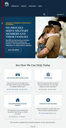
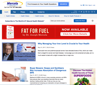
Let’s take a look at the landing pages of two very different sites to see how they compare to those first two areas of truth and reliability.
USAA Federal Savings Bank

- Their target audience is front and center. Images of military service people and their families are the clear focus.
- Services and products are presented clearly in easy to understand language.
- Ways to learn more, and how to choose the right product are immediately visible, presented in a way that is reassuring and friendly.
- Navigation is clear and uncluttered, easy to find exactly what you are looking for.
Mercola

- It’s clear that they provide answers to health questions. However, is only when you click on the disclaimer on the bottom of the page that you learn that the site is entirely “based on the opinion of Dr. Mercola…. And not intended as medical advice.”
- Their navigation seems to be a loosely related collection of tabs, with several different links to shopping areas rather than customer service.
- Ads for books and other products clutter the homepage, making it difficult to find what you are looking for.
- The content is presented with breathless hype, using phrases like “beware”, and “discover hidden secrets” that create a sense of mystery and illusion.
Which of these two sites inspires more trust?
USAA is the winner.
USAA’s website is a prime example of the ways in which to effectively establish trust through digital design. Notice the various ways in which the content is presented and the page is laid out compared to Mercola. USAA is renowned as a financial institution for world-class customer service. Mercola.com is one of the web’s biggest purveyors of fraudulent health-related content.
READ MORE: What Does Adaptive and Responsive Design Mean?, Flat Design: UX Expert Review, KLI UX Design Services for Agile Development, What Is Agile?, Tamagotchi Gesture and UX Design


Comments
Add Comment