

Within the last 5 years’ trend for UX Design, (user experience design) we have seen the focus placed not only on creating innovative features for the end-user but also to on the emergence of the ideology “Less is More”. The phrase “less is more” in reference to UX design means that the purpose of the UX Designer is not anymore to deliver a feature-heavy product, rather make the product leaner and amplify its functionality. Minimalism in UX Design means that sometimes, going the extra mile with design might not actually make a product better.
The phrase “Less is More” is a reflection of the theory of Minimalism and it’s becoming the new method of thinking to market simple, elegant and functional designs. The main principle of Minimalism is to provide only the essential part of the feature to the viewer (user). In minimalist web design, there is no extra text, unnecessary animation, and an effect on the design. On the other hand, everything that is presented on the page is deliberate and useful.
Minimalism is based on the concept that lies behind “Hicks Law”, which states that the more choices a person is presented with, the more time she/he will need to make a decision. Reducing the number of functions offered on a website page can optimize the user’s approach to decision making. Too many options might cause a user to become overwhelmed and ultimately, quit the task they are attempting to accomplish. As a result, applying a minimalist take on design can actually help to improve a user’s overall experience by reducing the distractions surrounding their ability to complete a task or make a decision. Reducing steps in the process to make the task simpler or faster goes a long way in creating a positive experience, while also being more cost-effective to only keep the features that the users need.
Minimalism and a UX Design Strategy
There are a few things to keep in mind when applying a Minimalist UX design:
-
Only include essential content - Content is the main focus and the interfaces are simplified by removing the elements that ultimately are not going to help the user perform the task.
-
Use of white space - The negative space between content is used to highlight the content itself.
-
Flat Design - In a flat design, everything from fonts to icons is kept to a minimum, which makes it functional and aesthetically pleasing.
-
Photos and Graphics illustrations - Images are a very important element of minimalist design as they can convey more emotion and thoughts than words. If the illustration is too crowded, it will revert the effect of the design.
-
Uniformity of colors - The limited use of the color palette is one of the key visual elements of minimalist design.
-
Bold typography - Designers apply this feature to emphasize the page content.
-
Design contrast - Minimalist designers tend to apply high contrast elements to bring out the most without having to put in a lot of effort. In addition, this is the most efficient way to drive the user’s attention towards the main elements of the page.
Best Practices for a Minimalist UX Design Strategy
For UX designers, it’s not always easy to approach the creation of a new website with a minimalistic mindset.
A few best practices to follow include:
-
Focus on the main element of the page
-
Hierarchical content distribution - most important at the top, less important at the bottom
-
Get rid of the excessive text in the content
-
A simple and convenient navigation system
-
Only incorporate functional animation
Examples of Minimalist Designs
Google Chrome browser provides a great example of a minimalistic approach to UX Design: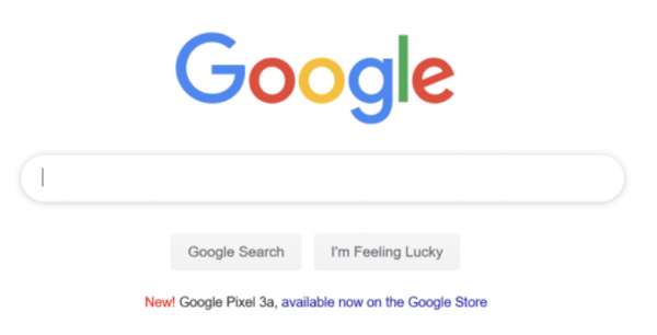 The experience is distilled to focus on the absolute essential functionality (Search), without any distraction or superfluous element. The negative space is abundant, highlighting the bold typography of the Google logo.
Another example of minimalist web design is the Lyft native mobile app.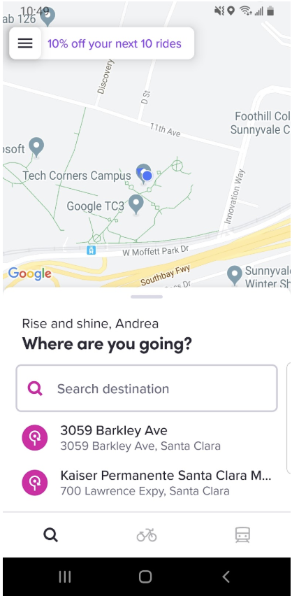 Lyft strikes out excessive text from the page, ensuring succinct and clear communication, relying on 4 words in the user interface: “Where are you going?”
Besides Google and Lyft, numerous other webpages (both desktop and mobile) of enterprise companies are undergoing a transformation towards more minimalistic user interfaces. Applying minimalism to UX design helps to create sleek and intuitive platforms that help to overall improve the user experience. A minimalist design allows the user to focus their attention on the core pieces of the interface, while allowing their user journey to be intuitive and purposeful.
READ MORE: Flat Design: UX Expert Review, The Three Things UX Designers Can Learn from Game Tutorials, Accessibility in UX Design, Should You Use Adaptive or Responsive Design?


Comments
Add Comment