When it comes to fast food, speed isn’t all that matters – but it making fast food faster certainly helps. Some people have favorite brands, and would never go to Burger King if they could get McDonald’s, or vice versa. But with all things equal, the most efficient or convenient option will often be the winner. Recently, we covered a trend in fast food apps where companies are allowing users to customize and place orders directly from their app, addressing this customer desire for efficiency. We dissected the act of customizing orders on four major apps to tease out how the user interfaces were serving customer needs. One company we did not cover is White Castle, whose most recent update came after our publication, but has gained our attention as something special.
Online ordering through an app is nothing new to White Castle. They’ve been offering this ability since as early as May 2012[1], which gives them a wealth of experience in this space. After reviewing this most recent update, it’s clear to us that White Castle has added some features that make it cutting edge in the online ordering space. First, let’s look at how White Castle stacks up to some of the apps we looked at previously, and then dive into what makes this new update so special.
Imagery:
One thing lacking from a few of the fast food apps we looked at was large, colorful imagery. Especially during the ordering phase, these apps were using three quarters or more of the screen real estate on text and option selection, with only small images of each food item or condiment. White Castle immediately greets users with high quality, screen-filling images of the various offerings when viewing the menu. Once a category is selected, it does revert to a similar approach as the other apps with small images along the side accompanied by large text describing each item. There is a compromise here, however, using the top 25% of the screen to show the main category image, keeping the page from being visually boring. We would still like to see larger images on the deeper pages, but White Castle has found a good middle ground for their strategy.
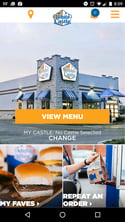
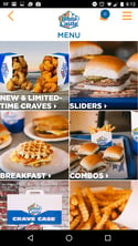
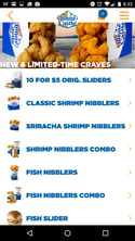
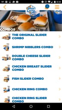
Pictured: The entry page and main menu are great examples of promoting product through imagery, but the detailed item pages favor large text over pictures.
Order Customization:
While many of White Castle’s orders are prefabricated, there is some ability to customize a particular slider or combo. Customers selecting a Double Cheese Slider, for instance, can choose to add egg, jalapeno cheese, bacon slices, or other condiments. White Castle handles this by bringing customers to a detailed page listing all of the add-ons or condiments, with small arrows that can be tapped left or right to change whether the customer wants that topping. These controls are smaller than is convenient, and the right facing arrow is nudged almost to the very edge of the screen. This placement makes the arrow difficult to interact with, especially if your phone is in a protective case. When choosing a combo, the drink selection is also a bit cumbersome. The first page shows types of drinks (i.e. cold drinks, hot drinks, shakes), followed by a screen showing brands or types (i.e. Coke, Diet Coke, Sprite), and finally a third screen allowing you to select size, ice options, or special instructions. Although this is all important information, it could likely be handled in one flowing screen rather than a series of steps. White Castle still lags behind companies like Wendy’s, whose offering we covered in detail in our previous article.
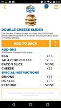
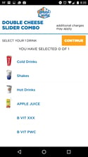
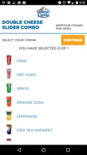
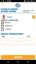
Pictured: The Slider customization page is lacking on imagery and the toggles are small and difficult to use. The drink selection menu has too many steps and could be more succinct.
New features:
So far White Castle stacks up pretty well with competitors, but what really sets it apart comes in the most recent update. The fast food industry was born on the desire for convenience and speed, and it would be easy to get bogged down when it comes to payment. Every first-time app user has to enter their credit card information, right? Nowadays, that limited experience is just not acceptable if you want to be on the leading edge of your industry. White Castle found a solution to this by integrating with Apple Pay, allowing users to pay with the credit card information they’ve already saved on their iPhone. This negates the need for users to enter credit card information, which could even save an order if they don’t have a credit card handy.
Additionally, White Castle has integrated an “Order History” tab, serving regulars who typically have the same, or similar orders. Maybe you have a complex modification to your slider, complete with special instructions that you type in each time. Now, you can reorder that with just a couple taps of your finger, or, if you want to change it, at least use that historical order as a starting point. Loyal customers like nothing more than being appreciated with special features like this, and we would bet that making customers’ lives easier is increasing retention for White Castle. If you’re in a hurry and all things are equal, are you going to use the app that requires you to start from square one, or are you going to use the one that knows who you are and what you like?
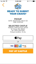

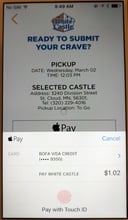
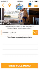
Pictured: Customers can use Apple Pay, a traditional credit card, or pay upon pickup. Order History allows re-ordering previous app orders.
In terms of overall offering, White Castle’s user interface and imagery are good, but not outstanding. But now that we’ve looked at these new features in tandem with the overall offering, let’s stop and think for a moment about how this ordering experience flows. Customers need only to select their items, verify the time and method of pick up, and hold their thumb on their lock button, and they’ve made an order. For an experienced user who is already logged in, this order could take less than a minute from opening the app to completing the order. That’s exactly the kind of touchpoint you want with your customer, and with these updates, the White Castle app puts a new meaning on the term “fast food.”
Read the full fast food app report that compares Wendy’s, Chipotle, Subway and Pizza Hut.
READ MORE: Is Panera Leading the Way for Restaurants With Their In-Store Experience?, Top 5 Usability Mistakes in To-Go Ordering, The Strengths of Adaptive Design and Responsive Design, Consumer Testing in a Mobile World





Comments
Add Comment