

To-go ordering has been around since the first caveman hollered to his neighbor that he was coming over to eat, but things have gotten more complicated in the last 50,000 years. Instead of asking for the flank or rib-eye of the woolly mammoth, now we’re thinking about geolocation, Apple Pay, and an awesome UI. Read on to hear about the top 5 usability mistakes in to-go ordering sites, and how to avoid making them in your app.
#1: Not enough payment options
While mobile payments like Apple Pay and Android/Samsung pay seemed like a potential fad only a year ago, it’s clear that these methods are here to stay. But while brick and mortar locations aren’t having trouble adapting, online ordering apps have been slower to adopt these additional options. Sure, a customer could always choose to pay in person when they’re picking up an order, but why not smooth out the entire transaction? We think it’s a must to include Android or Apple Pay, or PayPal at this point, along with traditional credit card entry. Limiting your purchasers to users who have their credit card information on them hurts conversion, and could turn a customer away. White Castle is aware of this, and recently added Apple Pay to their online ordering functionality, as pictured below.

#2: making restaurant/location selection difficult
No one assumes that their customers all have the same wants and needs. But looking at some online ordering apps, it sure doesn’t seem that way. Making it difficult to change your destination restaurant selection in an app or mobile site is a common usability mistake. Don’t default your customers to a location and make it hard to find where to switch. While this serves many of your customers, some may be on the road or are planning ahead for a pickup elsewhere as they’re sitting in their office. McDonald’s provides a stellar example of best practices for this. They default your location to the nearest McDonald’s, but allow you to easily change the restaurant by entering your address or looking through a list of nearby locations. It’s simple in execution, but eases the struggle for users going through untraditional purchase paths like those mentioned before.


#3: defaulting to delivery, not takeout prices
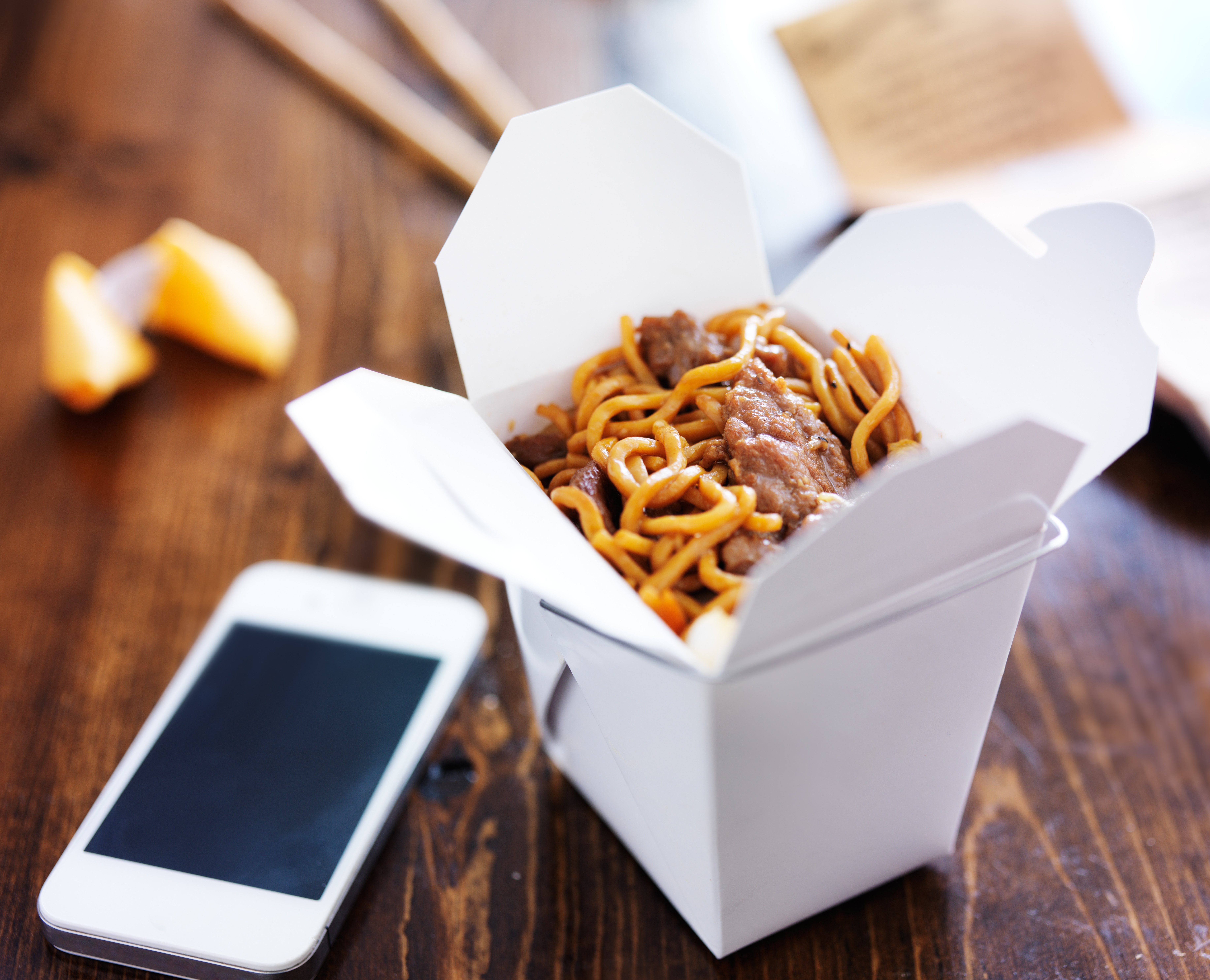
In metropolitan areas, food pick up and delivery service apps are popping up everywhere. From my location in Silicon Valley, there are at least five different services that pick up and deliver local food, or allow you to make orders for pick up. OrderAhead is one of those services, and although I enjoy using their services, I’m going to use them as a bad example in this case. In the OrderAhead app, the typical flow assumes that you’re ordering for delivery, and offers you a menu right away with the delivery tab highlighted in the middle of the screen. In this flow, when you view the menu, the prices are about 10% higher for each item due to a commission taken by OrderAhead. A customer might not notice that they’re in the delivery flow until the checkout process, at which point they might have already shied away from a particular restaurant due to the steep prices. It would be better to verify which service the user is interested in before moving forward, to avoid any confusion on pricing.
Pictured: Resturant main screen (image 1), Delivery prices (2nd image on left), Pickup prices (3rd image on right).


#4: hiding coupons
People love saving money, and we love it even more when it’s an unexpected savings. I had one of those delightful experiences lately with the Eat24 app, and it highlights a great practice in usability. When a small house party had run longer than expected, we suddenly were in need of a pizza infusion to make sure our guests were well fed. I was tasked with making the order, so I opened up the app that works with our local pizza place to save the trouble of speaking on the phone. As I distractedly proceeded through the checkout process, I was greeted with the option to use Android Pay to make the purchase, and save $5.00 in the process! I was more than happy to use the information that was saved to my phone already, for both convenience and security, but now I’m being offered a savings for doing what I would do already. In the heat of the moment, I didn’t snap a screenshot of the offer, but the app was nice enough to save my receipt so I could check it out later. Also of note are the various payment options offered – credit card, PayPal, Android Pay, and cash. Anything that makes a customer happy to have used your app is bound to net you repeat visits.


#5: lacking social integration
We’ll lean on Eat24 again for this final usability mistake. We recently talked to a handful of millennials about what they think make apps popular among their demographic. The repeated theme welling up was social integration – whether in Pinterest, Instagram, YikYak, or Snapchat, millennials love to see what others like them are doing. Eat24 has a leg up on their competition by integrating directly with Yelp, the omniprevalent review service, and as such they provide reviews, photos, and review highlights from the Yelp platform. This social integration immediately makes ordering on Eat24 a better experience than a competitor, who leaves you on your own to find out popular dishes, reviews, or photos.


Keeping in mind these five mistakes will help you design, update, or fix your to-go ordering app to make it as easy to use as possible. If you missed my last article on Making Fast Food Faster, catch up now on my review of online ordering through the new White Castle app. Bon Appétit!
For more information on our user research with food & beverage brands, and to learn how we can help you in your research plans, contact sales@keylimeinteractive.com.
READ MORE: Engaging Your Audience: Unlocking and Optimizing Multi-Screen Experiences, Making Food Faster, Is Panera Leading the Way for Restaurants With Their In-Store Experience?


Comments
Add Comment