
Last week we discussed the concept of minimalism in UX Design and the way in which the concept of “less is more” can actually improve the overall user experience through eliminating unnecessary clutter or distractions. As mentioned last week, the concept of minimalism is derived from the “Hicks Law” concept which posits that the more choices a user is presented with, the more likely they will need more time in order to make their decision. While minimalism seeks to enhance the overall user experience by transforming the UI (user interface), it is not the only design trend synonymous with this practice. Maximalism in User Experience (UX) Design, the opposite of minimalism, seeks to enhance the user experience through transforming the user interface, but this time by utilizing a variety of different patterns, colors, designs, and visual elements in order to create a design that is prominently eye-catching.
Maximalism vs Minimalism UX Design
This article is not to disregard the practice of applying minimalism to UX design, there are some websites and brands where applying a minimalistic design approach is a perfect fit. However, not every design trend is perfect for every website out there. Additionally, as minimalism in UX design becomes more and more popular, adopting a maximalist mindset can actually be a way for sites and brands to create differentiation. Maximalism is not just the opposite of minimalism in that it is an aesthetic of excess-maximalist practitioners believe that this method can help to effectively portray individualism through utilizing bold colors, patterns, textures and visuals to cover up any empty space. The idea behind a maximalist approach is to grab the audience’s attention and hold on to it by using different visual elements to help tell a story.
In an effort to better understand exactly what maximalism in UX design is, it is important to also understand what maximalism is not. Applying maximalism to UX design does not just mean cluttering a screen with a bunch of pictures, colors, texts, and more. After all, the design still has to be functional and usable by all different kinds of users. Maximalism is not about overwhelming the user, rather, it is about creating an experience that causes the user to feel a variety of sensations and emotions invoked by the design. A maximalist approach to design involves making bold, yet conscious, design and stylistic choices in an effort to capture the user's attention immediately, all while maintaining that the overall design is still functional, user friendly and intuitive. Therefore, maximalism is about intentionally utilizing design elements in a creative, innovative and exciting way, without deterring from the overall usability of a site.
Maximalism and UX Design Characteristics
The application of maximalism in UI UX design often encompasses the following characteristics:
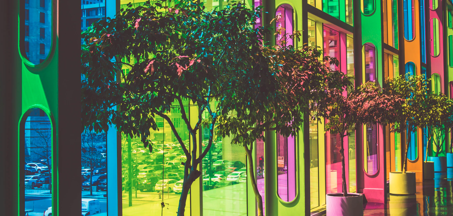
- Bold color combinations: Often maximalist design incorporates loud, neon, and other eye-catching colors.
- Contrasting patterns and motifs: Utilizing dense text and multiple fonts, opposing colors, or layered images and illustrations creates clashing layers of visual elements.
- Repeated graphic elements: Designers utilize repeated images, words, or audio/visual elements in order to create a mesmerizing effect.
- Little to no white space: Designers try to use different visual elements in order to take up space and reduce white space left on page.
- Visual Hierarchy: Designers implement a visual hierarchy where the most important information goes first and a deliberate style is utilized throughout the entire design.
Examples of Maximalist Design
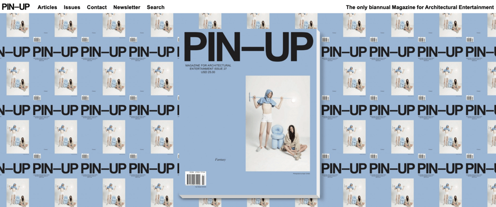
PIN-UP Magazine is an example of a website that applies a maximalist design. Through utilizing repeating images and texts, as well as leaving no white-space, PIN-UP Magazine has effectively applied maximalist design to their website without sacrificing usability- the main menu remains at the top, which helps guide the user to the tasks they wish to accomplish. In addition to being visually interesting, the large PIN-UP Magazine issue in the center of the page is actually clickable and takes the user to the most recent edition of the magazine, as well as a gallery of past editions
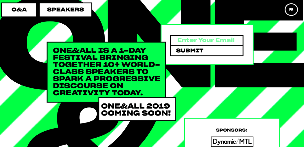
Another website that provides an excellent example of maximalist design application is the One and All conference for creatives website. Utilizing bright colors, as well as a visual animated background (the green and white stripes behind the content move), while maintaining clear and bold CTA buttons, highlights the various ways in which this website successfully applies maximalist principles.
Maximalism and UI UX design is a powerful combination of bold visual and stylistic choices, while masterfully maintaining overall usability and functionality. Masterfully combining both creates an overall user experience that is both captivating and functional. Maximalism aims to be bold, and to challenge our concepts of space, color, and visualizations- all the while creating an impactful experience that is remembered by their users. Both minimalism and maximalism have their positives when it comes to UI UX design, and as a result, it is particularly important to understand the brand and the users in order to decide which one to apply to your site.
READ MORE: The UX of Color, Design Thinking vs. Design Feeling, How Biometrics Help Designers Design Better, Tamagotchi Gestures and UX Design


Comments
Add Comment