Interaction with a product through a digital interface has become the standard across the industry, whether through a mobile app, desktop software, website, etc. it is the go-to for companies when creating a product to solve a problem. This is the reality we live in, but often users are not looking to add another interface or step to their routine. Users are instead looking to simplify a process. Zero UI looks beyond screens as the go-to solution and over to what would be a more natural and passive solution within a process to solve a problem. Not every process or product should be replaced by Zero UI.
The design thinking behind Zero UI should be to approach every problem with it as a possible solution, but not the only solution.
A popular example of Zero UI is Passive Entry systems in car doors. Passive Entry systems give drivers the ability to easily unlock and enter their car without having to go into their pocket or bag to find their car keys and press a button to unlock it. These systems instead connect to the key inside the driver’s pocket or bag and unlock the car door when the driver puts their hand on the car door handle. This is a great example of Zero UI because it finds a solution inside of the current natural process that drivers go through to get in their car. The process is to walk up to your car door, put your hand on the handle, and open the door. With these Passive Entry systems, the process remains unchanged, they don’t add any extra steps, they don’t require you to download an app, or look at a screen, instead, they find a way to seamlessly fit into the current flow.
Machine learning is another great example of Zero UI and is well implemented in technologies like the Nest Learning Thermostat. The Nest Learning Thermostat automatically adjusts the temperature according to previous use patterns and to save energy consumption, all without the user having to really do anything. I have a Nest Learning Thermostat and I haven’t touched it in a very long time because it knows my schedule and routine, and adjusts based off of previous use and trends.
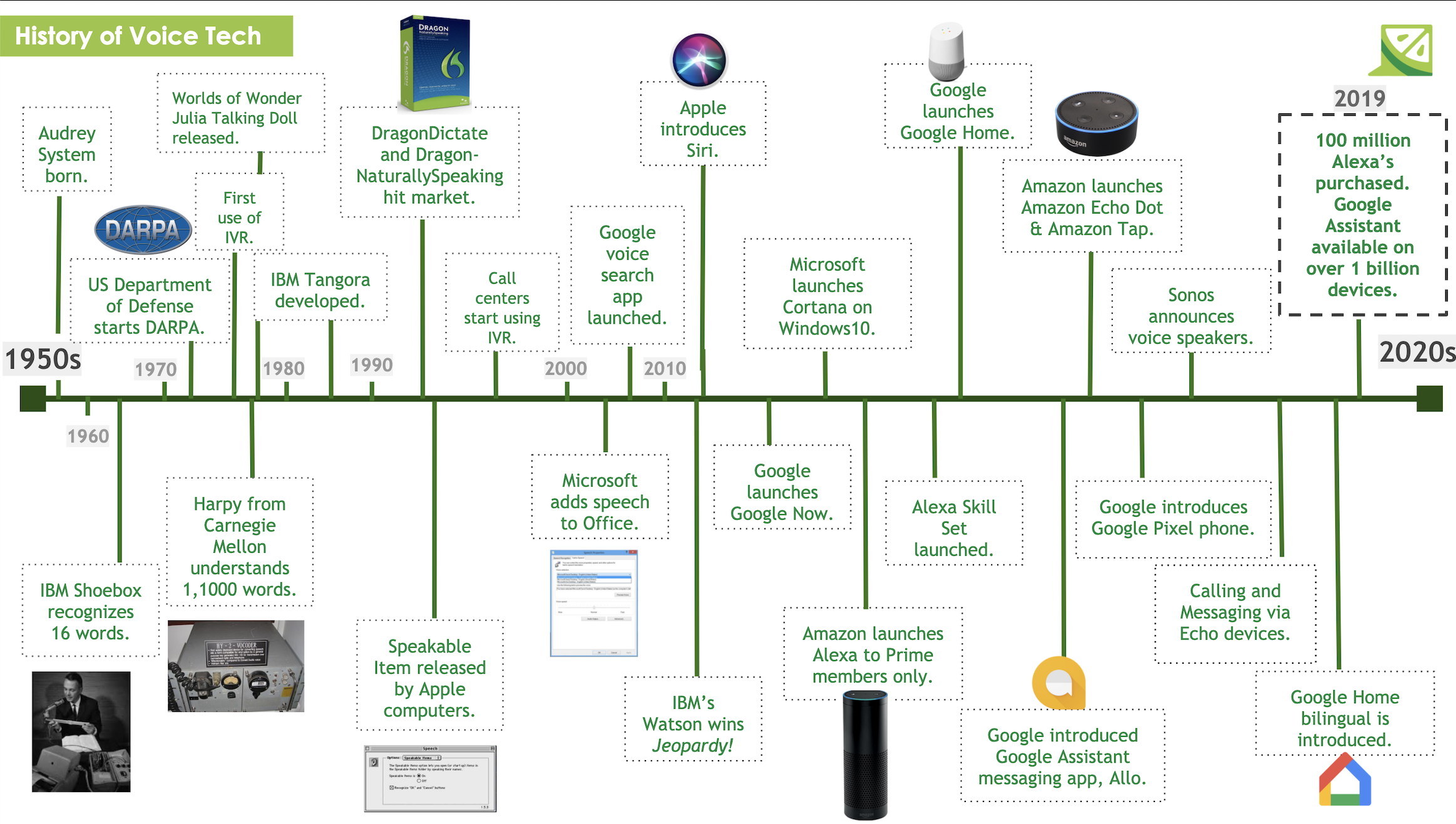
The times that I do have to adjust the temperature, I don’t go over to the thermostat to change it. Instead, I rely on another great example of Zero UI and say “Hey Google, turn the temperature down”, without leaving the comfort of my bed or couch. Smart assistants (like Siri, Alexa, or Google Assistant) add a layer of Zero UI to anything they are connected to, including information. Where before a user would have to open their phone, swipe to the Weather app, press the app, and then see the weather, now a user can just say “Hey Google, how’s the weather?”. Smart assistants allow users to commit the actions and obtain the information that they need, without having to pull out their phone or open their computer.
Smart assistants and machine learning are two examples that are still a work in progress, but what we are seeing now is the teardown of the traditional reliance on a digital interface.
These are just a few examples of Zero UI but the big takeaway is:
Zero UIs are best implemented when there is a passive solution inside of a natural process.
It is very easy, especially nowadays, to look towards apps or websites as the solution to most problems. For some solutions that make sense, but it is our job as UX Researchers, Designers, and Strategists to open up the world of possibilities for a product where Zero UI is an option.
READ MORE: Rise of AI and Zero UI, Role of UX in AI, Conversational UI's and Hybrid Interfaces, User Centered Design


Comments
Add Comment