
What are chatbots?
Chatbots are AI-controlled assistants that work through conversation in a typical chat flow that users have become accustomed to. Some work through existing chat applications like Facebook Messenger, while others are standalone apps for your mobile device. Chatbots work in a conversational manner (and are often referred to as a Conversation User Interface or CUI), but often include programmed response suggestions for the user to remove the possibility of misinterpreting information. I dove headfirst into some of the current chatbot apps and tested out some of their features to find examples of good user experience (UX) principles for this emerging technology and came up with these four key UX best practices for utilizing Chatbots.
Four Key UX best practices for utilizing Chatbots
- Introductions are Important
Most users are new to interacting with chatbots, and need some guidance when first getting started, and first interaction is key to establishing how the user will interpret the Chatbot.
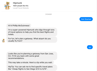
Hipmunk, a travel app, nails this first interaction. The bot exemplifies all of the following traits of an effective chatbot:
-
- Uses a conversational, casual tone
- Outlines the basic services it can provide
- Suggests a next step (choosing airport)
Even after the initial user response, Hipmunk continues to introduce ways to interact, by providing a quotation of something the user can type in for a response. This happens while the bot is searching, so there is no wasted back-and-forth with a failed command from the user to teach that lesson.
This is also covered in the talk Chatter Bots: Content Strategy for the Digital Interface as “Promoting yourself as a bot.”
- Use Visuals Whenever Possible
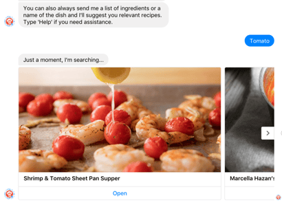
The meal planning app, Dinner Ideas, chatbot uses space very wisely. The app is very light in its use of text, but uses the saved space to show large images of potential recipes. Here I searched for “Tomato” and was quickly given a few recipes that use tomatoes, presented in a carousel of visuals for ease of navigation and understanding. The image carousel is a strong tool for chatbot apps, and should always be strongly considered when providing a list of image-based responses to a query.
- Don’t Over-Do It
I tested looking for hotels in Mountain View, CA on a Monday, and on Tuesday morning I got a Facebook message at 8 AM asking me if I was still interested. This was a bit frustrating as an unnecessary notification pop up on my phone coming through Messenger. In an app, this might lead me to silencing all notifications, but since Hipmunk relies on working through Facebook messenger, this wasn’t an option.
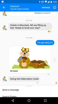
Luckily, when I loaded messenger, I was presented with the option to dismiss the invitation, and the bot assured me it was “Going into hibernation mode.” This may be enough for the time being, but it’s an important illustration that you need to tread carefully when and how the Chatbot goes about notifying it’s users.
- Include Variety In Your Interactions
Lark or Lark Chat is an app dedicated to helping you with your fitness and overall health, including things like logging food, and tracking activity and sleep. Lark provides a strong example of including a wide variety in their responses, so their users don’t feel like they’re talking to a bot. I tested out telling the Lark bot that I feel stressed, and on three different consecutive interactions I received three different responses.
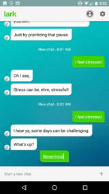
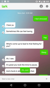
Typically a user wouldn’t report the same thing to a bot over and over, so these interactions would happen more spread out over time. Changing the response even for immediate interactions is important, however, and Lark really nails it with this approach. A slight wording change, like the switch from “Sometimes life can feel taxing.” to “Some days can be challenging,” and breaking out the “I hear ya,” into its own sentence or combining it with the same sentence provides very easy variety. This allows for the user to feel as though they are engaging in a natural conversation flow. You don’t necessarily need to program extremely different responses to succeed, and by making minor tweaks you can provide the semblance of a real human conversation for your users and greatly enhance their experience.
These apps are just the tip of the iceberg with chatbots, and there is a lot more to learn in the articles linked below. Contact us at Key Lime Interactive if you’re interested in discussing more about chatbots or any other topics we’ve been discussing in our blog.
READ MORE: What You Should Know About Zero UI, Amazon Echo and the Key Lime Miami Office, Flat Design: UX Expert Review, Creating a Successful User Esperience for Your Mobile Offering, Top 10 Considerations When Designing mCommerce Experiences for Millenials, Tamagotchi Gestures and UX Design



Comments
Add Comment