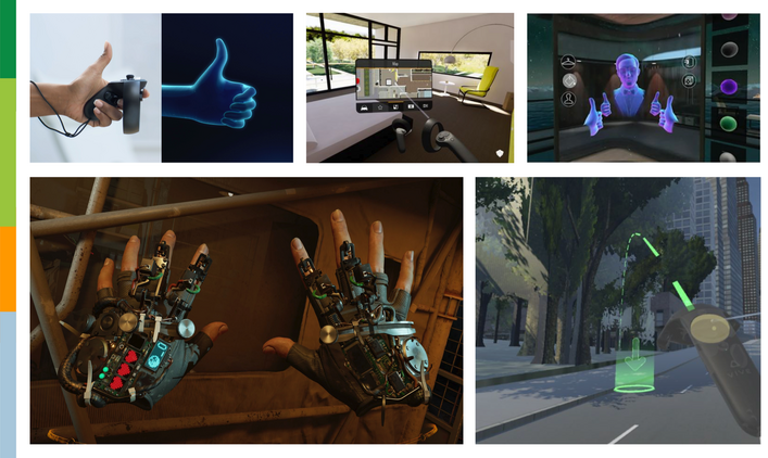
As Social XR (eXtended Reality) experiences continue to soar, enthusiasts speculate what will be the next leading trend. In Virtual Reality (VR), this needs to be an application that not only has great features to socialize and communicate with others but also gives users power to create these spaces themselves. Enter a new contender: Facebook Horizon.
Previously, we’ve discussed our anticipation for Facebook Horizon whilst reviewing a variety of Social XR meeting tools. After being invited to its closed beta, we’d like to dive deeper into the experience and give our feedback from a User Experience (UX) standpoint.
1. Facial Expressions & Gestures
Let’s start off with Facebook Horizon’s best feature: non-verbal communication. Horizon allows you to make a range of expressions by performing simple gestures. In the gif above, you can see me go from extreme happiness → to happiness → to confusion→ to disgust → to extreme disgust.
Without a good use case, a voice experience can become something that customers try only once or twice out of curiosity. A use case that provides value and helps customers to accomplish a goal or solve a problem increases engagement and retention
2. Social XR Interfaces
The interfaces were a bit more of a mixed bag. As mentioned earlier, there are 2 main ways of using Horizon: socializing & exploring with others and world building. Because these 2 main usages require different functionalities, they have completely different interfaces.
Socialization & Exploring Interfaces
Horizon deemed 3 buttons (settings menu, safety zone, mute/unmute) as most essential to the socialization & exploration experience and, as such, has made these 3 buttons accessible with a hand-based menu. The user just needs to rotate their wrist to find all 3 buttons and use their virtual hand to make a selection.
However, identifying which of the 3 you want to use is the tricky part. It is very easy to select the wrong button and feels a bit silly to include this interface when the user can easily press the oculus settings button on their controller instead. I’d recommend increasing the spacing between these buttons to avoid accidental presses.
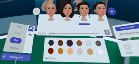
So what about the other GUIs (graphical user interface) in this space? Horizon also has a settings menu and a menu to customize your virtual avatar. While both flat, world-based interfaces that felt like they were in the ‘goldilock’ distance away from my eyes, the layout of the virtual avatar customization menu is different from the settings menu. The virtual avatar customization menu actually makes use of multiple screens at different angles, feeling a bit easier to look through; whereas the settings menu is flat and difficult to find options until you are told where to look. Additionally, the readability on the settings menu was slightly hard on the eyes. A heavier font with a larger size might have improved readability.
World Building User Interfaces
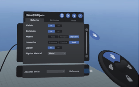
To be honest, I could write an entire review on just this area; however, I will try to be concise. The GUIs we see here have a similar pattern with the socialization & exploration interfaces. Horizon uses a hand-based interface so you can quickly access the most used options while world-based menus are where you can fine-tune settings. Unlike the socializing & exploration interfaces, Horizon actually gives the user more control of the GUIs themselves, allowing you to scale them, lock their placement and change views. Additionally, the user can select options on the hand-based interface with the joystick on their controller rather than with their virtual hands; this is a much smoother interaction
3. Locomotion
Horizon starts the user off defaulting with teleportation and 30° snap (typical in most VR experiences to minimize motion sickness); but once in the settings menu there is a wealth of options to specify your preferred type of locomotion. This is great for an inexperienced user!
Personally, I enjoy slide movement with 45° snap because I can be more fine-tuned with the direction where I want to go whilst minimizing the motion sicknesses I would get from continuous rotation. Horizon understands different users have different locomotion preferences.
4. Control for more advanced users
For an experienced user in the socialization & exploring spaces, I found there wasn’t enough control over the system. For example, while I liked setting my preferred locomotion options, I actually wanted to be able to navigate differently depending on the context. Considering A and B on the joysticks were inactive, I felt there was a missed opportunity to input a secondary locomotion option. I would have loved to have slide movement as my primary method with teleportation as my secondary method for when I want to quickly move longer distances.
Additionally, I found a lack of accessibility options over visual and audio features. Users should also be able to have control over elements that can easily distract them (e.i. loud noises, closed captioning, low background contrast, etc). For example, because Horizon only uses proximity-based spatial audio (which is great for immersion), I sometimes felt overwhelmed with background noises that distracted me from listening to & talking with others! Borrowing from gaming experiences, I’d recommend different volume controls for users, background music, and sound effects.
5. Remediation for harassment
From a UX standpoint, we know that it is imperative to consider early on how abusers will try to break the system. Applications need to consider features to prevent harassment, immediate features responding to a high anxiety inducing crisis, and what to do in order to recover from the crisis. Regarding crisis response, I am glad to see that you can quickly escape all other users if you are experiencing abuse, transporting you directly into the “safety zone.”
Horizon actually keeps a recording for the past few minutes in the application, in case you need to report the incident of abuse. While I happily welcomed the safety features Horizon implemented during beta, we do not yet know how this will play out once Horizon fully launches.
Considering Horizon is still in early beta, we are excited to see what happens next when more users are able to join at once during a full launch. There is so much left to explore as a social VR application. Heck, this review barely even touched on the usability of the world-building features or how effective Horizon is as a sketching/prototyping tool!
As we look at ways to socialize with each other virtually, it is also important to remember that Horizon is not the only Social VR experience out there creating fun experiences. For example, in about 5 hours of work, a user of VRChat, a social platform popularized by Twitch streamers and furies, created a virtual meme - an exact Four Seasons Total Landscaping replica - for any user to join. However, one thing is for sure, with the work put into Horizon’s facial expression, gestures and overall UX, it is on its way to become one of the best Social XR applications.





Comments
Add Comment