


BREAKING NEWS
The 2018 midterm elections are on November 6th!
….but it is unlikely that this is the first time that you are hearing about them. With all the news, coverage, and spin, we at KLI asked: “is UX being considered when covering politics?” We know that there are other places that you can find political opinions and hot takes, so you will not find any in this article. I will be staying focused on the UX of communicating and understanding politics, specifically on how different news organizations and outlets have tried to cover the midterm elections.
When news organizations provide good and valuable political coverage, they are thinking about their user. They are taking the perspective of their reader, their listener, or their viewer and trying to find the best way to communicate what is happening in politics and what the impact of the event(s) is. This can be done in many different ways, and it is always up for personalization and customization, but overall it has to simplify the complex findings and visualize it in a way that is easy to understand and consume.
This is the goal but there are several obstacles on the way to accomplishing this. One of the first roadblocks is how to interpret the available data. Especially when considering partisan lean and spin it can be difficult to decide what data you can trust. One good example of this is FiveThirtyEight’s Pollster Ratings where they analyze the historical accuracy and methodology of each pollster’s polls to come up with an average error, race accuracy, and more to give them a final letter grade.
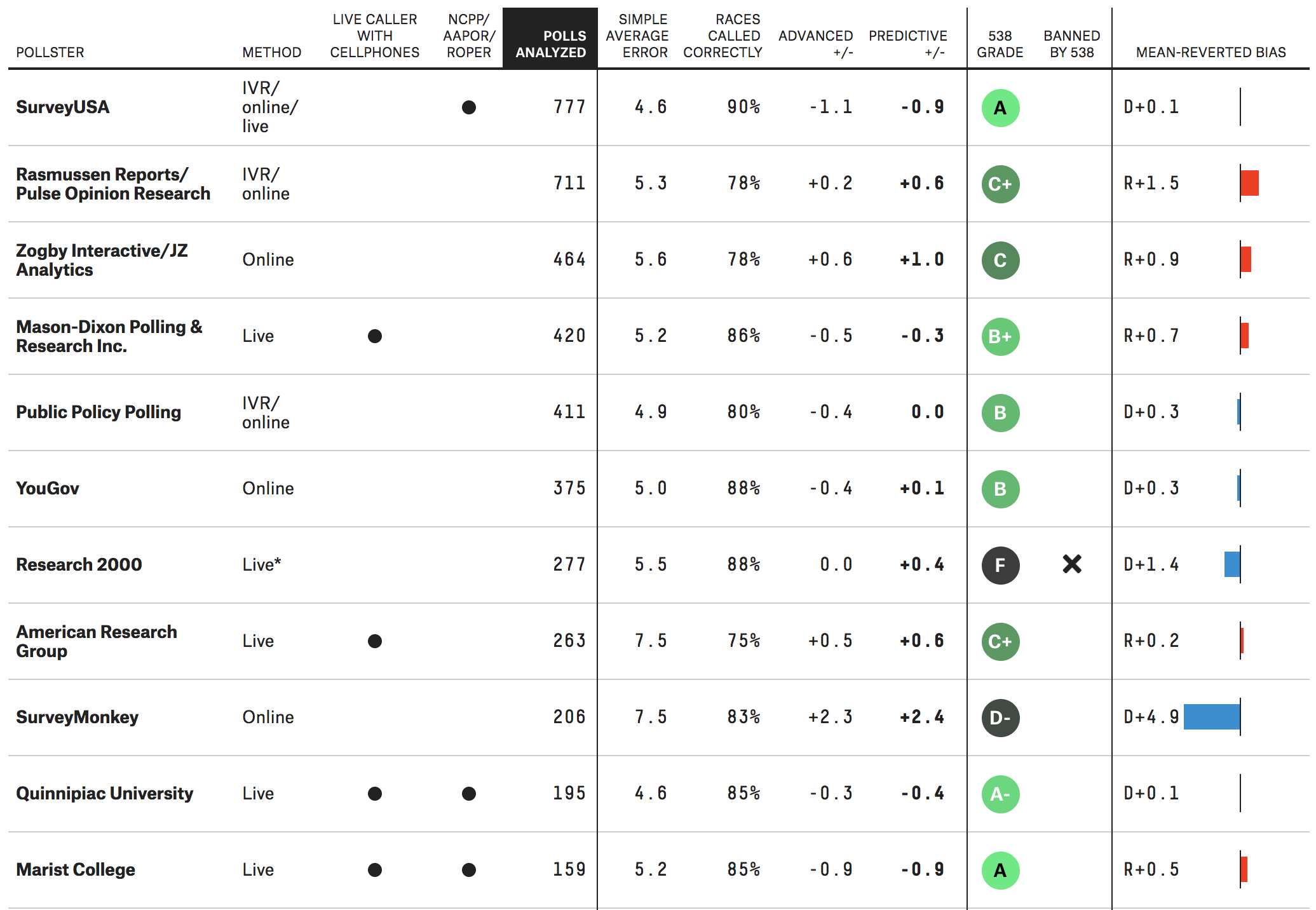 FiveThirtyEight’s Pollster Ratings on 10/30/18
This helps provide context for when their team (and their readers) are evaluating polls. RealClearPolitics also attempts to provide similar context around Fact Checkers in their Fact Check Review. In this weekly review, RealClearPolitics studies how six major fact-checking organizations operate and perform.
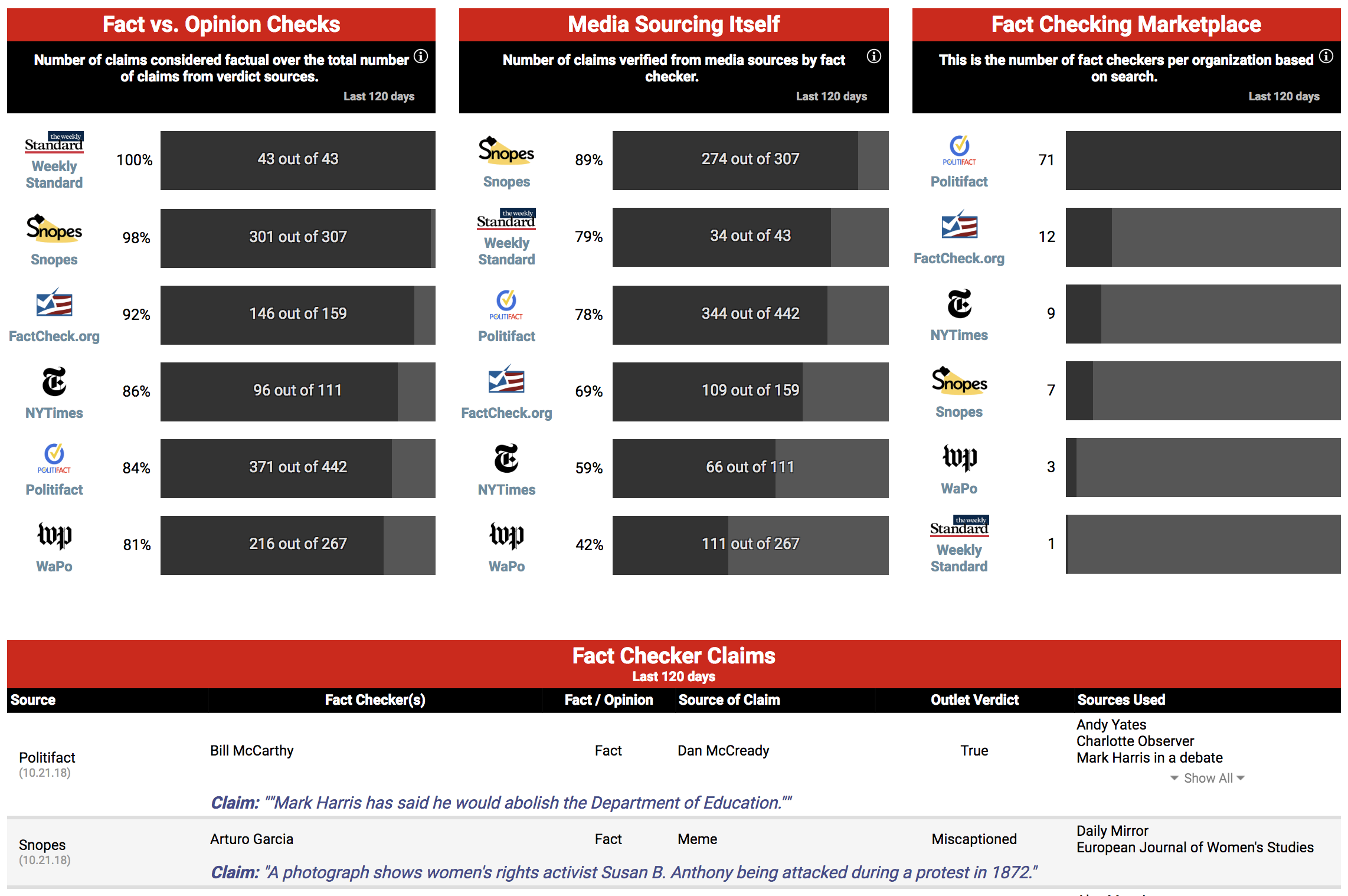 RealClearPolitics’s Fact Check Review on 10/30/18
In part due to the rise of disinformation (“Fake News”), the attention on fact-checking organizations has increased so RealClearPolitics attempts to provide a benchmark by tracking their performance. This helps frame how people use and trust these organizations to provide them unbiased and accurate fact-checking. These examples speak to the original point about how the most valuable politics coverage considers the user by arming them with the necessary background information to evaluate the data and information.
It can also be difficult to simply and clearly communicate the data and findings to the user. We know that using visualizations can help communicate complex findings and ideas, but this is a challenge due to the amount of context needed and the many different ways to interpret the data. One of the takeaways from the 2016 election coverage was that although most polls and forecasts showed Hillary Clinton as the favorite versus Donald Trump, Clinton was just a polling error away from losing the election. CNN’s House Forecast tries to communicate this by calling out the margin of error (in the visualization and in footnote to drive the point home).
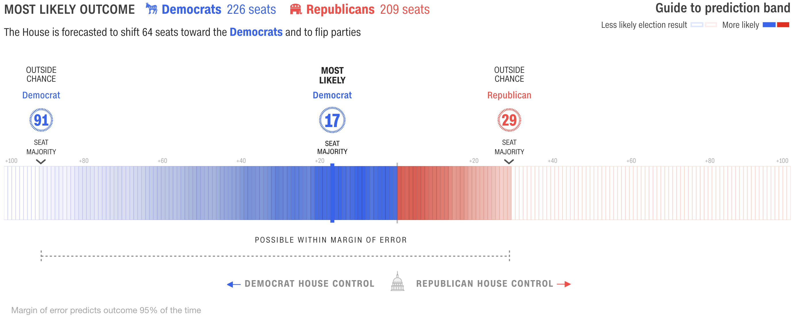 CNN’s 2018 House Forecast on 10/30/18
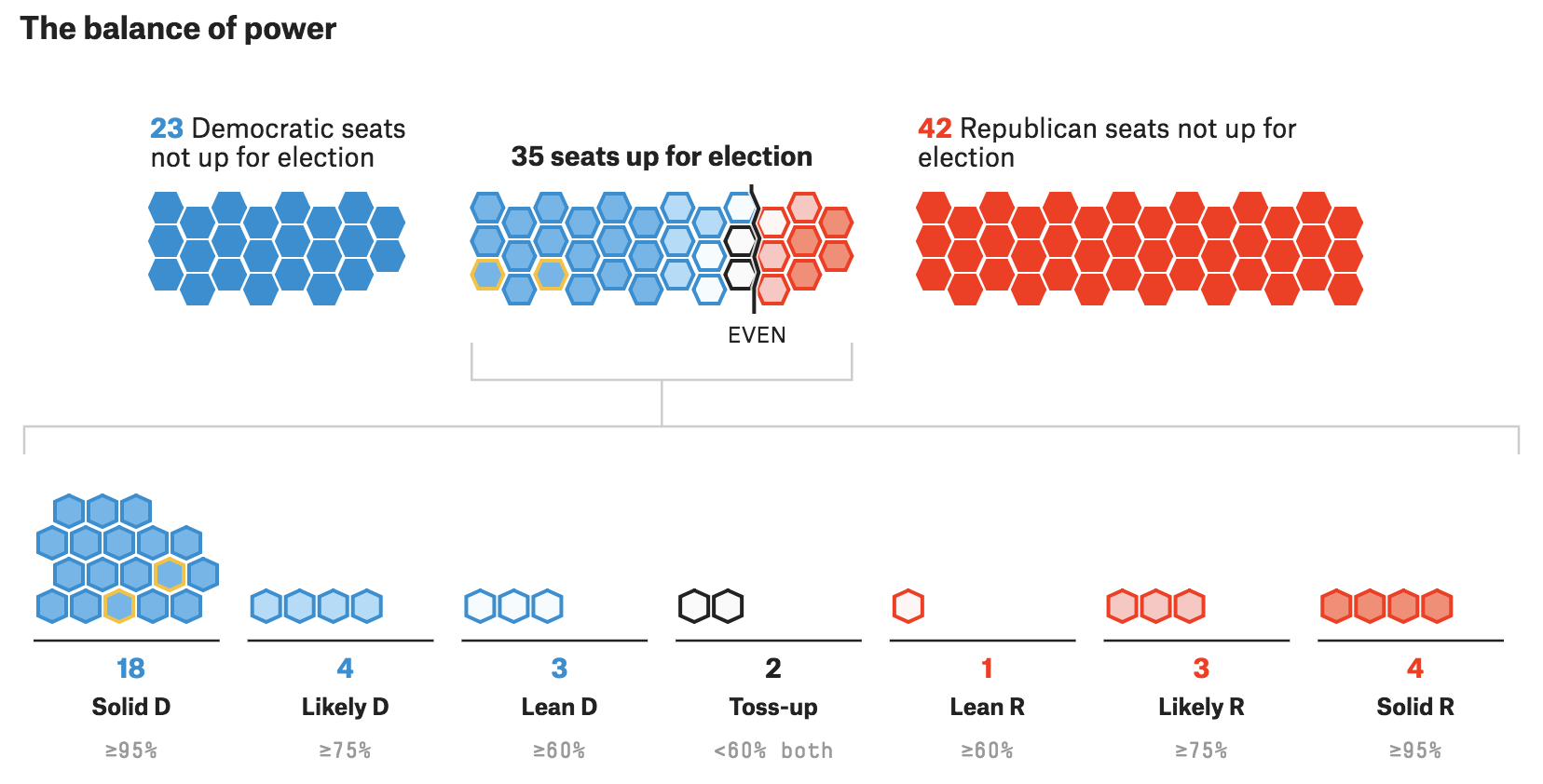
Not only are forecasters learning from their past mistakes, they are also providing important context for their users to be aware of when they look at any forecast or predictive model. FiveThirtyEight has several forecasts that provide multiple ways for their users to analyze and better understand the data.
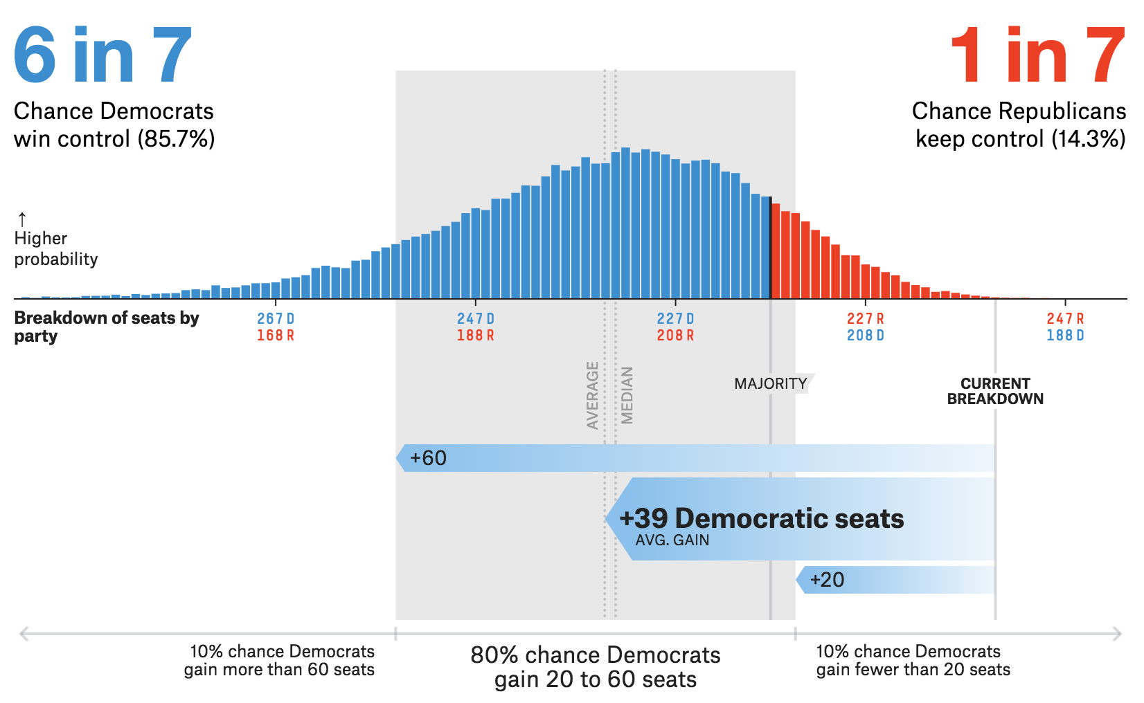 FiveThirtyEight’s House Forecast on 10/30/18
 FiveThirtyEight’s Senate Forecast on 10/30/18
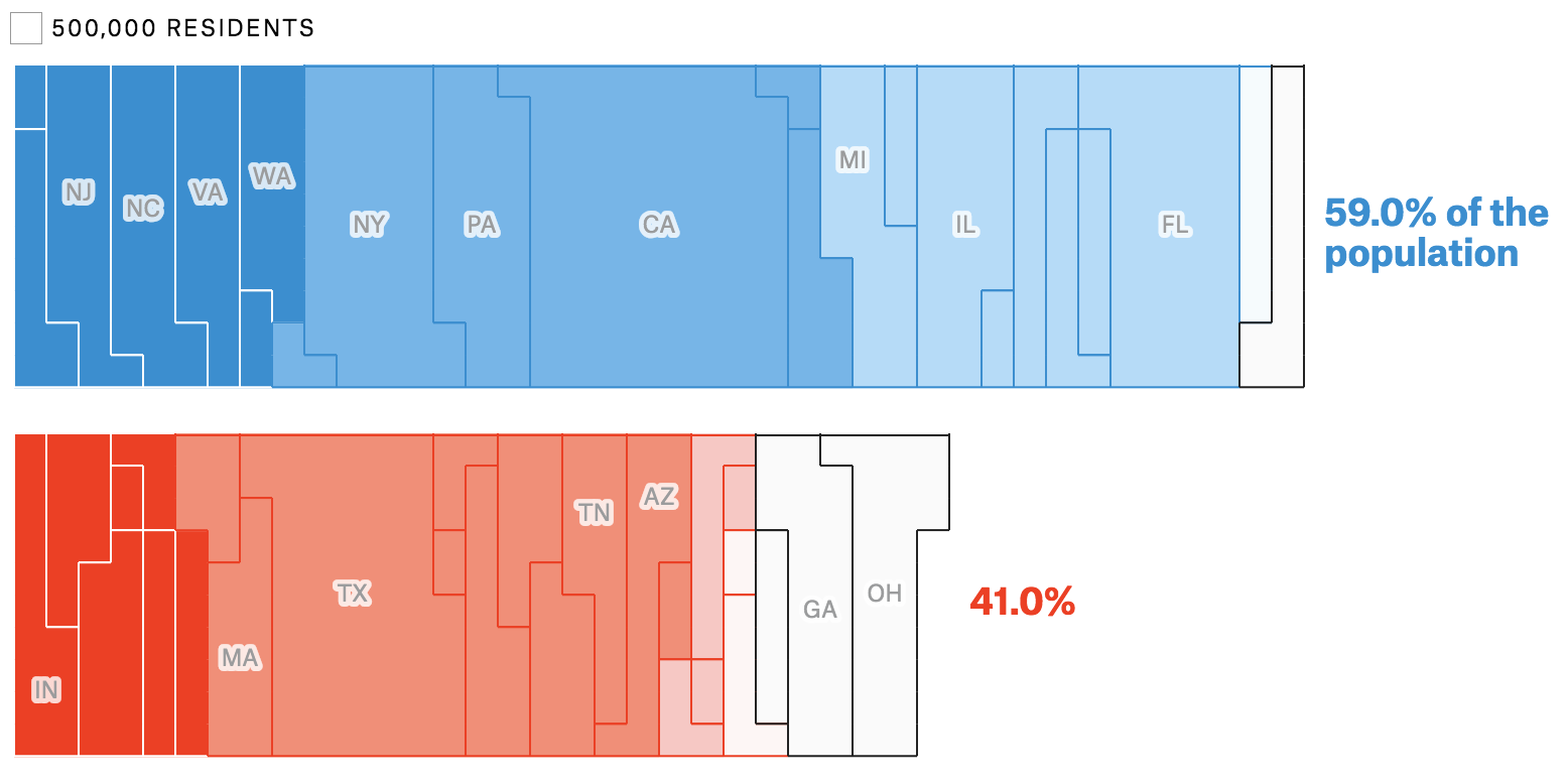 FiveThirtyEight’s Governor Forecast on 10/30/18
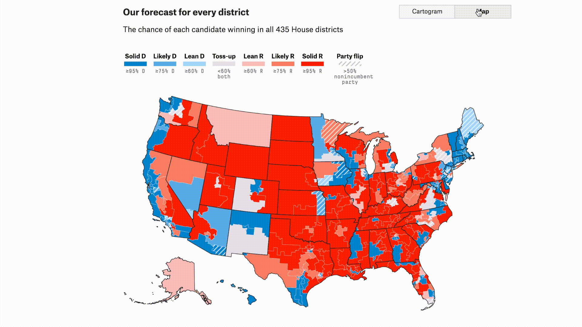 FiveThirtyEight’s House Forecast on 10/30/18
The examples above provide readers a lot of important context in a simple and easy to understand format so that FiveThirtyEight’s users don’t misinterpret and clearly understand the data.
By understanding what the value of your insights is, you can effectively and simply communicate complex and detailed data.
Finally, it feels as though politics in America has become more popular and important to the general public, so it is especially valuable when organizations help educate users. Polls are a very important piece of understanding politics so The Upshot ran Live Polls that users can watch in real-time. The Upshot hopes to help users learn about candidates, but also help them understand more about polling, how it works and (as they put it) why it sometimes doesn’t.
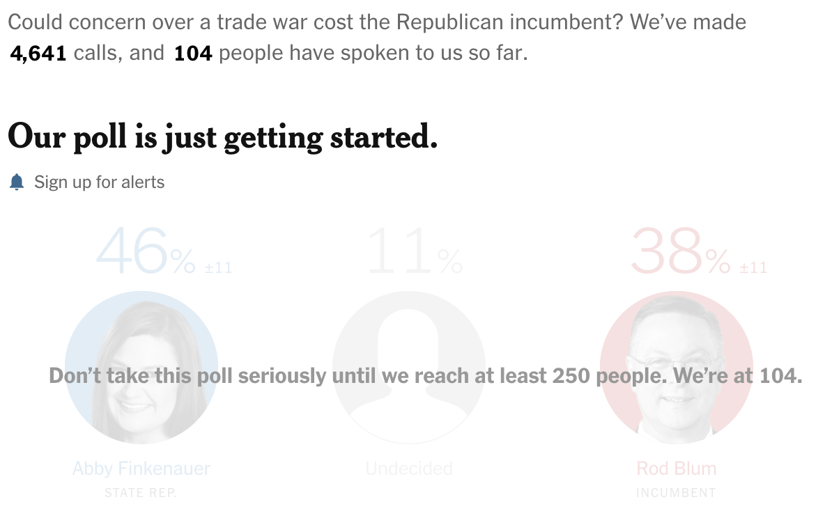 The Upshot’s Live Polls on 10/29/18
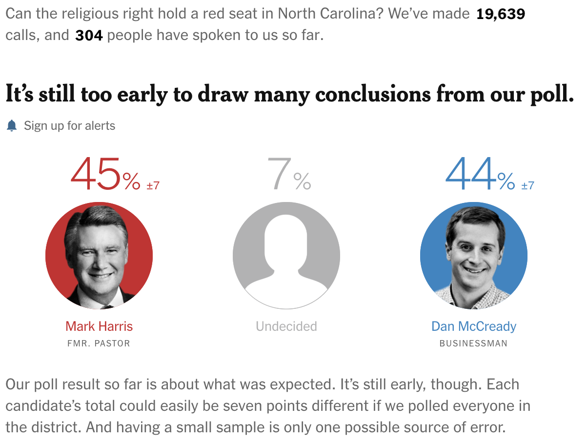 The Upshot’s Live Polls on 10/29/18
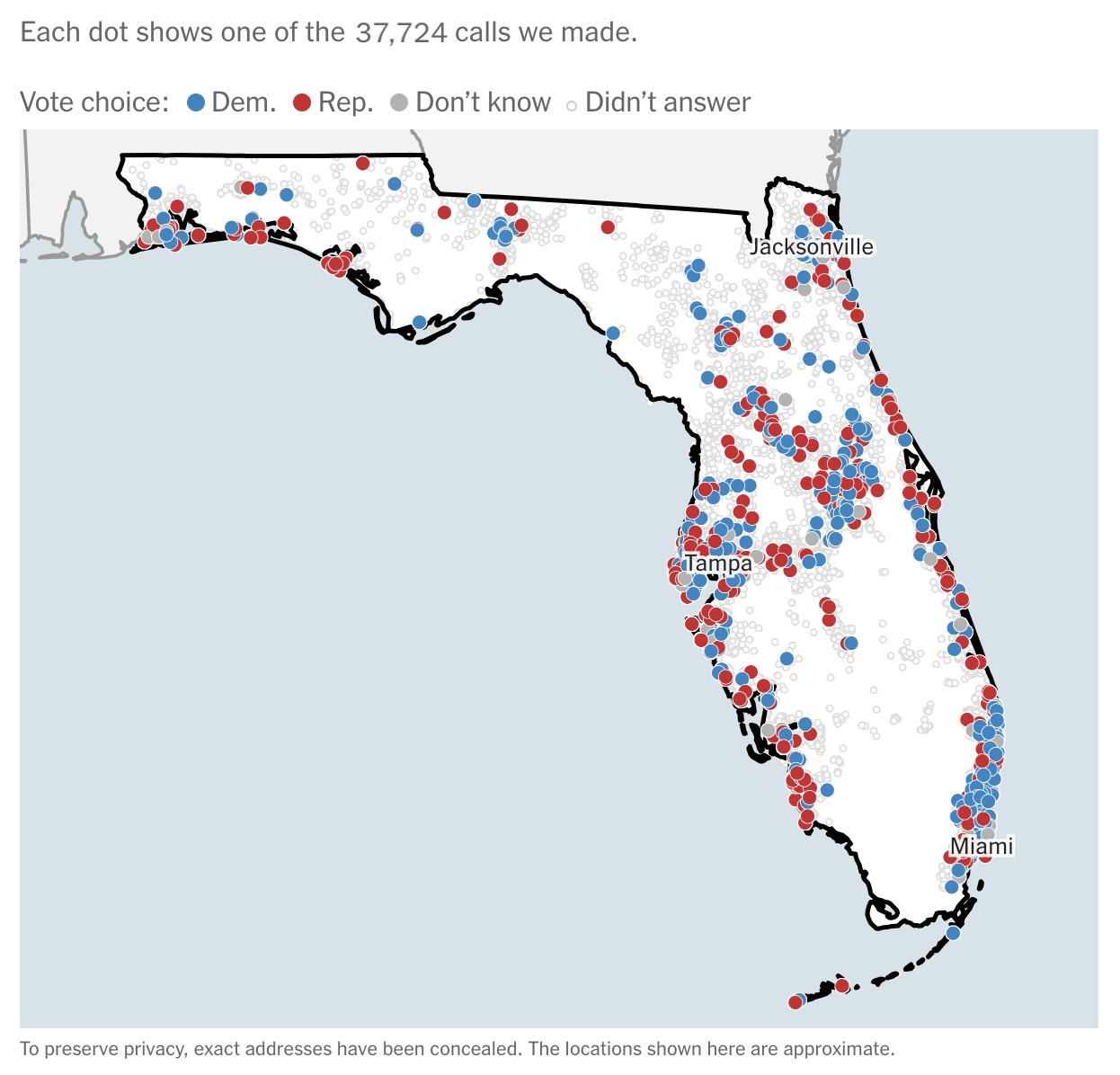 The Upshot’s Live Polls on 10/29/18
By providing this type of transparency, The Upshot is educating their users on how much work goes into polling (19,639 calls for 304 responses), when to trust a poll, when you shouldn’t, and other factors that can affect the results.
As Americans, we care about politics and what is next for our country, but as Key Limers and UXers in general, we appreciate these examples of organizations caring about their user by sharing insights in simple, creative, and valuable ways. In our work we work hard to do this because we know the impact and importance of our work for our clients and their users. This should be applicable across industries, and especially in politics where often how data is presented can have large and lasting effects.
READ MORE: The UX of Color, The UX of Scrolling, Three-Clicks Rule: UX Best Practice Revisited, The Value of UX as a Business Tool


Comments
Add Comment